STEP #2 - MEASURE CON’T
DATA & SAMPLING


Step #2 - MEASURE CON’T
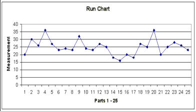
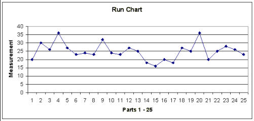
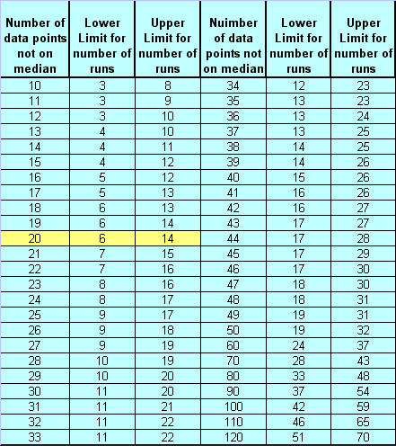
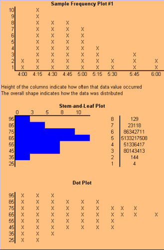
TIME SERIES PLOTS (Run Charts) Why use a run chart? · To study observed data for trends or patterns over a specified period of time. · To focus attention on vital changes in the process. · To track useful information for predicting trends or patterns. When to use a run chart: · To understand variation within the process. · To compare a performance measure before and after implementation of a solution to measure the impact. · To detect trends, shifts, and cycles in the process. How to construct a run chart: · Decide on the measure you are going to take to analyze data. · Gather the data - you should have a minimum of 20 or 30 data points. · Create a graph with a vertical line and a horizontal line (can be done with Microsoft Excel). · On the vertical line, or the "y-axis", draw the scale relative to the variable you are measuring. · On the horizontal line, or the "x-axis," draw the time or sequence scale. · Calculate the median and draw a horizontal line at the median value, going across the graph. · Plot the data in sequence or the time order in which the data was collected. · Identify runs (ignoring the points on the median line you drew). · Check the table for run charts listed below.On the chart above, look at the line where 25 is designated; this is your median number.
Looking at line 25, count how many points you have above and below that line, but not
touching the line. How many points are above or below, but not touching the median line
(line 25)? How many runs are there?
A "run" is a series of points on the same side of the median; a run can be any length from
one point to many points. Too few or too many runs are important signals indicating a
special cause because they indicate something in the process has changed. Since you
normally count runs on a time plot, they are also called run charts. In the chart above,
you will see that there are 5 data points that are on or touching the median. These points
are ignored because they neither add to nor interrupt the run. This leaves a total of 20
data points that should be counted for the run test, and of that there are 11 runs in the
above example. For example, point #1 is below the line, so that is 1 run. Next you will find
points #2 thru 5 above the line, which is a second run.
The number of runs you expect to see in a stable process depends on the number of
data points. The chart listed below indicates how many runs could be expected when
only common cause variation is present. In the chart above, there were 20 points that
were not on or touching the median (line 25) and 11 runs (or collective groups of points
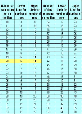
above/below the median). That is well within the range of 6 - 14 listed in the table below,
so you can reasonably conclude that there are no special causes of variation based on
the run chart above. The way the chart works is that you look at how many points were
not on the median, and in this case 20; then you look at the table to find out what the
lower limit for runs is and the upper limit for runs and then determine if the runs you
counted fall into that range. See the chart below.
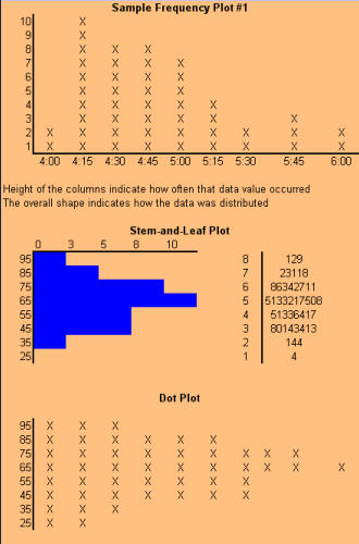
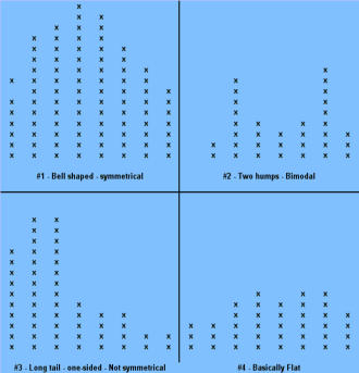
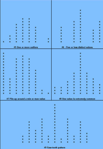
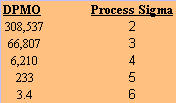
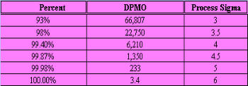
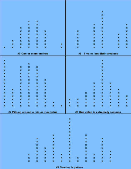
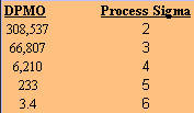
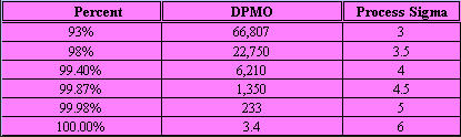
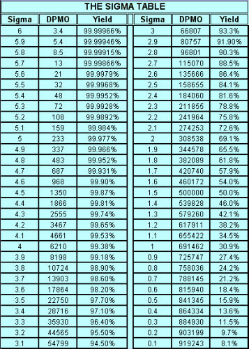
Signals of when Special Cause is present: · Too many or too few runs. · 6 or more points in a row continuously increasing or decreasing (a "trend"). · 8 or more points in a row on the same side of the median (a "shift"). · 14 or more points in a row alternating up and down. Control Chart (Individuals) A Control chart plots time-ordered data, just as run charts do, however, the difference is that statistically determined control limits are drawn on the plot. The centerline calculation uses the mean, not the median. Why use a Control Chart: · Statistical control limits establish the process capability. · Statistical control limes are another way to separate common cause and special cause variation; points outside the statistical limits signal a special cause. · Can be used for almost any type of data collected over time. · Provides a common language for discussing process performance. When to use a Control Chart: · Track performance over time. · Evaluate progress after process changes/improvements · Focus attention on detecting and monitoring process variation over time. You can go to our example Control Charts within this web site to see how to make a control chart, and an example for you to learn from. How to construct a Control Chart: · Select the process to be charted. · Determine sampling method and plan. · Initiate the data collection. · Calculate the appropriate statistics. · Plot the data values on the first chart (mean, median, or individuals). · Plot the range or standard deviation of the data on the second chart (only for continuous data). · Interpret the control chart and determine if the process is "in control." What are control limits? A Control limit defines the bounds of common cause variation in the process; thus, it is a tool that you can use to help make the right decision and thus take the right action: · If all points are between the limits, you can assume that only common cause variation is present. · If a point falls outside the limit, above or below, you should treat it as a special cause. · You do not investigate the individual data points, rather, study the common cause variation in all data points. Control limits for individuals' charts are calculated by the average +/- 2.66 times the average of the moving range. Control Charts and tests for special causes: · On a control chart, any data point outside the control limits is a signal of a special cause. · Two of the previous tests - counting "runs" and "8 points" - are determined relative to the median of the data; however, on a control chart, the centerline is the average, not the median. · You can use the average with caution if you think the data have a roughly "normal" distribution. "With caution" means to check your interpretation in other ways before taking action. Control Charts (X-bar, R) When data are collected in rational subgroups, it makes sense to use an X-bar, R chart. In the rational subgroup, we hope to have represented all the common causes of variation and none of the special causes of variation. X-bar, R charts allow you to detect smaller shifts than individuals charts do. Additionally, they allow you to clearly separate changes in process average from changes in process variability. An X-bar, R chart uses the variation within subgroups to establish limits for the averages of the subgroups. When there is more variation between subgroups than within subgroups, a special cause will be signaled. The X-bar chart will not detect special causes within a subgroup, therefore, selection of the subgroups is of primary importance. Averages will always show less variability than individual values, so you expect the control limits on an X-bar chart to be narrower than limits for individual values. The constants noted on the calculations chart for d2 and A2 (see control charts page) are the result of having less variability. As you view the chart in the web page section for X-bar, R charts, you can see that the lower control limit for the Range chart is always "0" until you have 7 or more data points within a subgroup. Interpreting the X-bar, R chart. · Use the signals of special causes on both charts. · Look at the R chart first - if the range chart is unstable (has special causes), the limits on the chart will be of little value. If the range chart is unstable, it is unsafe to draw conclusions about variation in the process average. · Look for positive and negative correlations between the data points on the X-bar and the R chart (both move in the same direction or in opposite directions for every point). This happens when the data have a skewed distribution, and some conclusions may be affected. When to use X-bar, R charts: · Though used in both administrative and manufacturing applications, it is the tool of first choice in most manufacturing applications. · Advantages over other charts - subgroups allow for a precise estimate of "local" variability; changes in process variability can be distinguished from changes in process average. · Small shifts in process average can be detected. Frequency Plots A frequency plot shows the shape or distribution of the data by showing how often different values can occur. Why use a frequency plot? · To summarize data from a process and graphically present the frequency distribution in a bar form for analysis. · To help answer the question whether the process is capable of meeting the customer's requirements, and to show if the process is a normal distribution or if it is skewed to one side, or multi-faceted. When to use a frequency plot: · To display large amounts of data that are too difficult to interpret in tabular form. · To show the relative frequency of occurrence of the various data values. · To reveal the centering, spread and variation of the data. · To illustrate quickly the underlying distribution of the data. Frequency plots come in a number of shapes and formats, depending upon what you are going to measure, and the person designing the plot chart. There is no real wrong way to create one, as long as you can determine what you are going to measure and measure it accordingly in your chart. The two charts shown above actually display the same data but on different types of frequency plot charts. If you plot the counts of items, or number of items, you are actually recording a Histogram (SEE HISTOGRAM PAGE) and if you click here, you can see an example from within our web site. If you plot where individual data values are indicated by simple symbols of using a "dot", an "X" or a "l", you are creating what is called a "dot plot." Steam-and-leaf plots, however, show the actual numeric values: major units to the left of the line ("stem") and minor units to the right of the line ("leaf" or leaves). You can always tell the exact data values. The method of construction on each of the plot charts is quite similar. In the Dot Plot chart above , the tick mark labels (95, 85, 75 and so forth) indicate that the data values are clustered into units of 10. Anything between 20 and 29 is plotted at value 25, values between 30 and 39 at 35, and so on. The practice of clustering data values is common with frequency plots because the overall shape and distribution is usually more important to your understanding, than is the exact values. That is, you want to find out where the data value groups fall. How to construct a Frequency Plot: 1. Decide on the process measure. 2. Gather data (at least 50 data points). 3. Prepare a frequency table of the data. a. count the number of data points. b. Calculate the range. c. Determine the number of class intervals. d. Determine the class width (0-5, 0-10, etc.) e. Construct the Frequency table. 4. Draw a frequency plot (histogram) of the table. 5. Interpret the graph. What to look for on a frequency plot: · Center of the data · Range of the data · Shape of the distribution · Comparison with target and specifications · Any irregularities. If a frequency plot shows a bell-shape, even and symmetrical distribution (see graph #1 above): - Conclude - no special causes indicated by the distribution; data may come from a stable process. (Caution - special causes might appear on a time plot or control chart). - Action - make fundamental changes to improve a stable process (common cause strategy). If a frequency plot shows a two-humped, bimodal distribution (see graph #2 above): - Conclude - what you thought was one process operates like two separate processes. - Action - use stratification or other analysis techniques to seek out the causes for the two humps; be wary of reacting to a time plot or control chart for data with this type of distribution. If a frequency plot shows a long-tailed distribution -not symmetrical (see graph #3 above): - Conclude - data may come from a process that is not easily explained with simple mathematical assumptions (like normality). A long-tailed pattern is quite common when measuring time or counting problems. - Action - use data analysis techniques with some caution when data has a long- tailed distribution. Some methods may lead you to a false conclusion. To deal with data on this type of distribution, you may have to transform it. If a frequency plot shows a basic flat distribution (see graph #4 above): - Conclude - process may be "drifting" over time or the process may be a mix of many operating conditions. - Action - use time plots to track over time; look for possible stratifying factors; standardize the process. If a frequency plot shows one or more outliers (see graph #5 above): - Conclude - outlier data points are likely the result of clerical error or something unusual happening in the process. - Action - confirm outliers are not a clerical error and that they are an actual measurement from that process; treat like a special cause. If a frequency plot reveals five or fewer distinct values (see graph #6 above): - Conclude - measuring device is not sensitive enough, or the measurement scale is not fine enough to break samples down further. - Action - fine tune measurements by recording additional decimal points or places. If a frequency plot reveals a large pile-up of data points at one major location (see graph #7 above): - Conclude - a sharp cut-off point occurs if the measurement instrument is incapable of reading across the complete range of data, or when people ignore data that goes beyond a certain limit. - Action - improve measurement devices. Eliminate fear of reprisals for recording "unacceptable" data. If a frequency plot reveals one value that is extremely popular or common (see graph #8 above): - Conclude - when one value appears far more commonly than any other value, the measuring instrument may be damaged or hard to read, or the person recording the data may have a subconscious bias, or needs proper training. - Action - check measurement instrument, check person recording the measurement, check data collection practices. If a frequency plot shows a saw-tooth pattern (see graph #9 above): - Conclude - when data appear in alternating heights, the recorder may have a subconscious bias for even or odd numbers; the measuring instrument may not be easy to make readings with, data values may have been rounded off incorrectly, or method of measuring is not precise enough to meet measurement required. - Action - check measuring instrument and procedures being used. Important note: Histograms are more appropriately used for large data sets, like larger than 50 samples. Dot plots are useful for small or large data sets. PARETO CHARTS Once again, there is an extensive section on Pareto charts within this web site and you can visit that section by clicking Returning to the Pareto Charts in the Lessons Page. The Pareto Principle implies that we can frequently solve a problem by identifying and attacking its "vital few" sources; generally the vital few have the most accumulations and have relevance to other related problems. React to a Pareto Chart when the Pareto Principle applies, or, a few categories are responsible for most of the problems. Often the data that you collect can best be viewed by dividing it into categories. A Pareto Chart is one of the best tools for looking at categorical data, or for determining which group is your biggest problem area. Why use a Pareto Chart? · To understand the pattern of occurrence for a set of problems. · To judge the relative impact of various parts of a problem area. · To track which is the biggest contributor to a problem. · To decide where to focus your efforts. When to use a Pareto Chart? · The problem you are studying can be broken down into categories for better analysis. · To identify the "vital few" categories to focus improvement effort upon. Features of a Pareto Chart: · Used for categorical data. · The height of a bar represents relative importance of that aspect of the problem. · The bars are arranged in descending order of importance from left to right. · The bar displaying the biggest problem is always on the left. · The height of the vertical axis represents the sum of all occurrences (not just the height of the tallest bar). How to construct a Pareto Chart (again, see the Pareto chart on this web site): 1. Decide which problem you want to analyze. 2. Gather the necessary data. 3. Compare the relative frequency (or cost) of each problem category. 4. List the problem categories (sorted by frequency) on the horizontal line and frequencies on the vertical line. 5. Draw the cumulative percentage line showing the portion of the total that each problem category represents. 6. Interpret the overall results. What to look for in the Pareto Chart: · Relative heights of the bars (including the height of the Y-axis). · Size of the other category - make sure you can't make another category from some of the "other" data. That is, don't combine too many items in one category that might be better off split up. · Type of data used to create the chart - is the chart based on valid data? Reaction Plan: · Begin working on the largest category bar(s). · When you have narrowed the problem down to one or two items, then proceed to Phase 3 - Analyzing Causes. When the Pareto Principles does not hold - when all the bars are roughly the same height and/or many categories are needed to account for most of the problem, you need to find another way to analyze the data. Process Capability Process capability measures are statistical measures that summarize how much variation there is in a process relative to customer specifications. Uses of Process Capability Indices: · Provides management with a single number to assess the performance of a process. · Provides a scale by which processes can be compared. You can state that process "X" is more capable than process "Y" if the capability index for process "X" is greater than the capability index for process "Y". Such comparison can help you prioritize improvement efforts. · Shows over time whether a particular process is more capable to meet specifications. To increase process capability, you have to decrease the process variation. Less variation provides: · Greater predictability in the process, allowing us to make reliable forecasts, meets schedules for orders, etc. · Less waste and rework, which lowers costs. · Products and services that perform better and last longer. · Customers how are much more pleased with their product quality. Process Sigma Process Sigma builds on the basic foundation of process data and specification limits. While process sigma shares some features with process capability indices, process sigma may also be applied to: · Any situation where you can count the defects in meeting customer specifications. · Multi-step processes, in the event you want an overall measure of process performance. The process sigma scale is listed below: DPMO means defects per million opportunities and the Process Sigma is the same as process capability. An increase in process sigma requires exponential defect reduction. (Distribution shifted ± 1.5 s). The preferred, standard method of determining DPMO is to use actual process data and count how many defect opportunities are outside the specification limits; then scale that number up to the equivalent of a million opportunities. Why use process sigma as a metric? · It is a more sensitive indicator than percentage is. · It focuses on the defects. Even one defect reflects a failure in your customer's eyes. Determining Process Sigma: · Process Sigma is the capability of the process relative to specifications for that process. · In practice, you determine yield for each step, then combine those yields to determine overall process sigma. · To determine yields, you will need to know what a defect is and a defect opportunity. Terminology: Process Sigma = an expression of process yield (based on DPMO). Unit = the item produced or processed. CTQ = Critical to Quality Defect = any event that does not meet a customer specification; a defect must be measurable. Defect Opportunity = a measurable chance for a defect to occur. Defective = a unit with one or more defects. Defect Opportunities: An opportunity occurs each time the product, service, or information is handled, the point at which a customer quality requirement is either met or missed. Defect opportunities counts the number of times a requirement could be missed, not the ways in which it is missed. The number of opportunities per unit must stay constant before and after improvement. An opportunity should be based on a defect that can reasonably occur. If something has never been a problem, then don't count that as an opportunity. Caution: Inflating the number of opportunities will artificially inflate the sigma level. The number of defect opportunities should bear some relevance to the complexity of the value-added process; that is, more complex processes should have more opportunities than simple processes do. Definitions are critical - apply the concept of Operational Definitions to both defects and opportunities. Make sure that everyone who works with sigma values understands and agrees on critical definitions. Defects - focus on customer requirements. Clearly specify what is an opportunity so that all involved with understand the definition. COMPLETION CHECKLIST: Upon completion of this Phase, and before moving on to Phase 3: ANALYZE, you should be able to precisely define what problems are occurring and under what conditions they are likely to appear. You should have data in hand that you can use to demonstrate as having been able to MEASURE. That said, you should be able to show: · What specifically is the main problem or problems. · How you prioritized and selected critical input, process and output measures. · What you have done to validate the measurement system. · What patterns are exhibited in the data. · What the current process capability is. Finally, listed below I give the Sigma Table so that you can have a chart to define the Sigma factor, the DPMO and yield relative to each Sigma level. THIS IS THE END OF THE MEASURE PHASE - GO BACK TO SIX SIGMA PAGE AND START ANALYZE PHASE TO CONTINUE LEARNING ABOUT SIX SIGMA
© The Quality Web, authored by Frank E. Armstrong, Making Sense Chronicles - 2003 - 2016


STEP #2 - MEASURE CON’T
DATA & SAMPLING

Step #2 - MEASURE CON’T
TIME SERIES PLOTS (Run Charts) Why use a run chart? · To study observed data for trends or patterns over a specified period of time. · To focus attention on vital changes in the process. · To track useful information for predicting trends or patterns. When to use a run chart: · To understand variation within the process. · To compare a performance measure before and after implementation of a solution to measure the impact. · To detect trends, shifts, and cycles in the process. How to construct a run chart: · Decide on the measure you are going to take to analyze data. · Gather the data - you should have a minimum of 20 or 30 data points. · Create a graph with a vertical line and a horizontal line (can be done with Microsoft Excel). · On the vertical line, or the "y-axis", draw the scale relative to the variable you are measuring. · On the horizontal line, or the "x-axis," draw the time or sequence scale. · Calculate the median and draw a horizontal line at the median value, going across the graph. · Plot the data in sequence or the time order in which the data was collected. · Identify runs (ignoring the points on the median line you drew). · Check the table for run charts listed below.On the chart above, look at the line where 25 is
designated; this is your median number. Looking
at line 25, count how many points you have above
and below that line, but not touching the line.
How many points are above or below, but not
touching the median line (line 25)? How many
runs are there?
A "run" is a series of points on the same side of
the median; a run can be any length from one
point to many points. Too few or too many runs
are important signals indicating a special cause
because they indicate something in the process
has changed. Since you normally count runs on a
time plot, they are also called run charts. In the
chart above, you will see that there are 5 data
points that are on or touching the median. These
points are ignored because they neither add to
nor interrupt the run. This leaves a total of 20
data points that should be counted for the run
test, and of that there are 11 runs in the above
example. For example, point #1 is below the line,
so that is 1 run. Next you will find points #2 thru 5
above the line, which is a second run.
The number of runs you expect to see in a stable
process depends on the number of data points.
The chart listed below indicates how many runs
could be expected when only common cause
variation is present. In the chart above, there were
20 points that were not on or touching the
median (line 25) and 11 runs (or collective groups
of points above/below the median). That is well
within the range of 6 - 14 listed in the table below,
so you can reasonably conclude that there are no
special causes of variation based on the run chart
above. The way the chart works is that you look at
how many points were not on the median, and in
this case 20; then you look at the table to find out
what the lower limit for runs is and the upper limit
for runs and then determine if the runs you
counted fall into that range. See the chart below.
Signals of when Special Cause is present: · Too many or too few runs. · 6 or more points in a row continuously increasing or decreasing (a "trend"). · 8 or more points in a row on the same side of the median (a "shift"). · 14 or more points in a row alternating up and down. Control Chart (Individuals) A Control chart plots time-ordered data, just as run charts do, however, the difference is that statistically determined control limits are drawn on the plot. The centerline calculation uses the mean, not the median. Why use a Control Chart: · Statistical control limits establish the process capability. · Statistical control limes are another way to separate common cause and special cause variation; points outside the statistical limits signal a special cause. · Can be used for almost any type of data collected over time. · Provides a common language for discussing process performance. When to use a Control Chart: · Track performance over time. · Evaluate progress after process changes/improvements · Focus attention on detecting and monitoring process variation over time. You can go to our example Control Charts within this web site to see how to make a control chart, and an example for you to learn from. How to construct a Control Chart: · Select the process to be charted. · Determine sampling method and plan. · Initiate the data collection. · Calculate the appropriate statistics. · Plot the data values on the first chart (mean, median, or individuals). · Plot the range or standard deviation of the data on the second chart (only for continuous data). · Interpret the control chart and determine if the process is "in control." What are control limits? A Control limit defines the bounds of common cause variation in the process; thus, it is a tool that you can use to help make the right decision and thus take the right action: · If all points are between the limits, you can assume that only common cause variation is present. · If a point falls outside the limit, above or below, you should treat it as a special cause. · You do not investigate the individual data points, rather, study the common cause variation in all data points. Control limits for individuals' charts are calculated by the average +/- 2.66 times the average of the moving range. Control Charts and tests for special causes: · On a control chart, any data point outside the control limits is a signal of a special cause. · Two of the previous tests - counting "runs" and "8 points" - are determined relative to the median of the data; however, on a control chart, the centerline is the average, not the median. · You can use the average with caution if you think the data have a roughly "normal" distribution. "With caution" means to check your interpretation in other ways before taking action. Control Charts (X-bar, R) When data are collected in rational subgroups, it makes sense to use an X-bar, R chart. In the rational subgroup, we hope to have represented all the common causes of variation and none of the special causes of variation. X-bar, R charts allow you to detect smaller shifts than individuals charts do. Additionally, they allow you to clearly separate changes in process average from changes in process variability. An X-bar, R chart uses the variation within subgroups to establish limits for the averages of the subgroups. When there is more variation between subgroups than within subgroups, a special cause will be signaled. The X-bar chart will not detect special causes within a subgroup, therefore, selection of the subgroups is of primary importance. Averages will always show less variability than individual values, so you expect the control limits on an X-bar chart to be narrower than limits for individual values. The constants noted on the calculations chart for d2 and A2 (see control charts page) are the result of having less variability. As you view the chart in the web page section for X-bar, R charts, you can see that the lower control limit for the Range chart is always "0" until you have 7 or more data points within a subgroup. Interpreting the X-bar, R chart. · Use the signals of special causes on both charts. · Look at the R chart first - if the range chart is unstable (has special causes), the limits on the chart will be of little value. If the range chart is unstable, it is unsafe to draw conclusions about variation in the process average. · Look for positive and negative correlations between the data points on the X-bar and the R chart (both move in the same direction or in opposite directions for every point). This happens when the data have a skewed distribution, and some conclusions may be affected. When to use X-bar, R charts: · Though used in both administrative and manufacturing applications, it is the tool of first choice in most manufacturing applications. · Advantages over other charts - subgroups allow for a precise estimate of "local" variability; changes in process variability can be distinguished from changes in process average. · Small shifts in process average can be detected. Frequency Plots A frequency plot shows the shape or distribution of the data by showing how often different values can occur. Why use a frequency plot? · To summarize data from a process and graphically present the frequency distribution in a bar form for analysis. · To help answer the question whether the process is capable of meeting the customer's requirements, and to show if the process is a normal distribution or if it is skewed to one side, or multi-faceted. When to use a frequency plot: · To display large amounts of data that are too difficult to interpret in tabular form. · To show the relative frequency of occurrence of the various data values. · To reveal the centering, spread and variation of the data. · To illustrate quickly the underlying distribution of the data. Frequency plots come in a number of shapes and formats, depending upon what you are going to measure, and the person designing the plot chart. There is no real wrong way to create one, as long as you can determine what you are going to measure and measure it accordingly in your chart. The two charts shown above actually display the same data but on different types of frequency plot charts. If you plot the counts of items, or number of items, you are actually recording a Histogram (SEE HISTOGRAM PAGE) and if you click here, you can see an example from within our web site. If you plot where individual data values are indicated by simple symbols of using a "dot", an "X" or a "l", you are creating what is called a "dot plot." Steam-and-leaf plots, however, show the actual numeric values: major units to the left of the line ("stem") and minor units to the right of the line ("leaf" or leaves). You can always tell the exact data values. The method of construction on each of the plot charts is quite similar. In the Dot Plot chart above , the tick mark labels (95, 85, 75 and so forth) indicate that the data values are clustered into units of 10. Anything between 20 and 29 is plotted at value 25, values between 30 and 39 at 35, and so on. The practice of clustering data values is common with frequency plots because the overall shape and distribution is usually more important to your understanding, than is the exact values. That is, you want to find out where the data value groups fall. How to construct a Frequency Plot: 1. Decide on the process measure. 2. Gather data (at least 50 data points). 3. Prepare a frequency table of the data. a. count the number of data points. b. Calculate the range. c. Determine the number of class intervals. d. Determine the class width (0-5, 0-10, etc.) e. Construct the Frequency table. 4. Draw a frequency plot (histogram) of the table. 5. Interpret the graph. What to look for on a frequency plot: · Center of the data · Range of the data · Shape of the distribution · Comparison with target and specifications · Any irregularities. If a frequency plot shows a bell-shape, even and symmetrical distribution (see graph #1 above): - Conclude - no special causes indicated by the distribution; data may come from a stable process. (Caution - special causes might appear on a time plot or control chart). - Action - make fundamental changes to improve a stable process (common cause strategy). If a frequency plot shows a two-humped, bimodal distribution (see graph #2 above): - Conclude - what you thought was one process operates like two separate processes. - Action - use stratification or other analysis techniques to seek out the causes for the two humps; be wary of reacting to a time plot or control chart for data with this type of distribution. If a frequency plot shows a long-tailed distribution -not symmetrical (see graph #3 above): - Conclude - data may come from a process that is not easily explained with simple mathematical assumptions (like normality). A long-tailed pattern is quite common when measuring time or counting problems. - Action - use data analysis techniques with some caution when data has a long- tailed distribution. Some methods may lead you to a false conclusion. To deal with data on this type of distribution, you may have to transform it. If a frequency plot shows a basic flat distribution (see graph #4 above): - Conclude - process may be "drifting" over time or the process may be a mix of many operating conditions. - Action - use time plots to track over time; look for possible stratifying factors; standardize the process. If a frequency plot shows one or more outliers (see graph #5 above): - Conclude - outlier data points are likely the result of clerical error or something unusual happening in the process. - Action - confirm outliers are not a clerical error and that they are an actual measurement from that process; treat like a special cause. If a frequency plot reveals five or fewer distinct values (see graph #6 above): - Conclude - measuring device is not sensitive enough, or the measurement scale is not fine enough to break samples down further. - Action - fine tune measurements by recording additional decimal points or places. If a frequency plot reveals a large pile-up of data points at one major location (see graph #7 above): - Conclude - a sharp cut-off point occurs if the measurement instrument is incapable of reading across the complete range of data, or when people ignore data that goes beyond a certain limit. - Action - improve measurement devices. Eliminate fear of reprisals for recording "unacceptable" data. If a frequency plot reveals one value that is extremely popular or common (see graph #8 above): - Conclude - when one value appears far more commonly than any other value, the measuring instrument may be damaged or hard to read, or the person recording the data may have a subconscious bias, or needs proper training. - Action - check measurement instrument, check person recording the measurement, check data collection practices. If a frequency plot shows a saw-tooth pattern (see graph #9 above): - Conclude - when data appear in alternating heights, the recorder may have a subconscious bias for even or odd numbers; the measuring instrument may not be easy to make readings with, data values may have been rounded off incorrectly, or method of measuring is not precise enough to meet measurement required. - Action - check measuring instrument and procedures being used. Important note: Histograms are more appropriately used for large data sets, like larger than 50 samples. Dot plots are useful for small or large data sets. PARETO CHARTS Once again, there is an extensive section on Pareto charts within this web site and you can visit that section by clicking Returning to the Pareto Charts in the Lessons Page. The Pareto Principle implies that we can frequently solve a problem by identifying and attacking its "vital few" sources; generally the vital few have the most accumulations and have relevance to other related problems. React to a Pareto Chart when the Pareto Principle applies, or, a few categories are responsible for most of the problems. Often the data that you collect can best be viewed by dividing it into categories. A Pareto Chart is one of the best tools for looking at categorical data, or for determining which group is your biggest problem area. Why use a Pareto Chart? · To understand the pattern of occurrence for a set of problems. · To judge the relative impact of various parts of a problem area. · To track which is the biggest contributor to a problem. · To decide where to focus your efforts. When to use a Pareto Chart? · The problem you are studying can be broken down into categories for better analysis. · To identify the "vital few" categories to focus improvement effort upon. Features of a Pareto Chart: · Used for categorical data. · The height of a bar represents relative importance of that aspect of the problem. · The bars are arranged in descending order of importance from left to right. · The bar displaying the biggest problem is always on the left. · The height of the vertical axis represents the sum of all occurrences (not just the height of the tallest bar). How to construct a Pareto Chart (again, see the Pareto chart on this web site): 1. Decide which problem you want to analyze. 2. Gather the necessary data. 3. Compare the relative frequency (or cost) of each problem category. 4. List the problem categories (sorted by frequency) on the horizontal line and frequencies on the vertical line. 5. Draw the cumulative percentage line showing the portion of the total that each problem category represents. 6. Interpret the overall results. What to look for in the Pareto Chart: · Relative heights of the bars (including the height of the Y-axis). · Size of the other category - make sure you can't make another category from some of the "other" data. That is, don't combine too many items in one category that might be better off split up. · Type of data used to create the chart - is the chart based on valid data? Reaction Plan: · Begin working on the largest category bar(s). · When you have narrowed the problem down to one or two items, then proceed to Phase 3 - Analyzing Causes. When the Pareto Principles does not hold - when all the bars are roughly the same height and/or many categories are needed to account for most of the problem, you need to find another way to analyze the data. Process Capability Process capability measures are statistical measures that summarize how much variation there is in a process relative to customer specifications. Uses of Process Capability Indices: · Provides management with a single number to assess the performance of a process. · Provides a scale by which processes can be compared. You can state that process "X" is more capable than process "Y" if the capability index for process "X" is greater than the capability index for process "Y". Such comparison can help you prioritize improvement efforts. · Shows over time whether a particular process is more capable to meet specifications. To increase process capability, you have to decrease the process variation. Less variation provides: · Greater predictability in the process, allowing us to make reliable forecasts, meets schedules for orders, etc. · Less waste and rework, which lowers costs. · Products and services that perform better and last longer. · Customers how are much more pleased with their product quality. Process Sigma Process Sigma builds on the basic foundation of process data and specification limits. While process sigma shares some features with process capability indices, process sigma may also be applied to: · Any situation where you can count the defects in meeting customer specifications. · Multi-step processes, in the event you want an overall measure of process performance. The process sigma scale is listed below: DPMO means defects per million opportunities and the Process Sigma is the same as process capability. An increase in process sigma requires exponential defect reduction. (Distribution shifted ± 1.5 s). The preferred, standard method of determining DPMO is to use actual process data and count how many defect opportunities are outside the specification limits; then scale that number up to the equivalent of a million opportunities. Why use process sigma as a metric? · It is a more sensitive indicator than percentage is. · It focuses on the defects. Even one defect reflects a failure in your customer's eyes. Determining Process Sigma: · Process Sigma is the capability of the process relative to specifications for that process. · In practice, you determine yield for each step, then combine those yields to determine overall process sigma. · To determine yields, you will need to know what a defect is and a defect opportunity. Terminology: Process Sigma = an expression of process yield (based on DPMO). Unit = the item produced or processed. CTQ = Critical to Quality Defect = any event that does not meet a customer specification; a defect must be measurable. Defect Opportunity = a measurable chance for a defect to occur. Defective = a unit with one or more defects. Defect Opportunities: An opportunity occurs each time the product, service, or information is handled, the point at which a customer quality requirement is either met or missed. Defect opportunities counts the number of times a requirement could be missed, not the ways in which it is missed. The number of opportunities per unit must stay constant before and after improvement. An opportunity should be based on a defect that can reasonably occur. If something has never been a problem, then don't count that as an opportunity. Caution: Inflating the number of opportunities will artificially inflate the sigma level. The number of defect opportunities should bear some relevance to the complexity of the value- added process; that is, more complex processes should have more opportunities than simple processes do. Definitions are critical - apply the concept of Operational Definitions to both defects and opportunities. Make sure that everyone who works with sigma values understands and agrees on critical definitions. Defects - focus on customer requirements. Clearly specify what is an opportunity so that all involved with understand the definition. COMPLETION CHECKLIST: Upon completion of this Phase, and before moving on to Phase 3: ANALYZE, you should be able to precisely define what problems are occurring and under what conditions they are likely to appear. You should have data in hand that you can use to demonstrate as having been able to MEASURE. That said, you should be able to show: · What specifically is the main problem or problems. · How you prioritized and selected critical input, process and output measures. · What you have done to validate the measurement system. · What patterns are exhibited in the data. · What the current process capability is. Finally, listed below I give the Sigma Table so that you can have a chart to define the Sigma factor, the DPMO and yield relative to each Sigma level. THIS IS THE END OF THE MEASURE PHASE - GO BACK TO SIX SIGMA PAGE AND START ANALYZE PHASE TO CONTINUE LEARNING ABOUT SIX SIGMA
© The Quality Web, authored by Frank E. Armstrong, Making Sense
Chronicles - 2003 - 2016