STEP #3 - ANALYZE
ORGANIZE & ANALYZE DATA


© The Quality Web, authored by Frank E. Armstrong, Making Sense Chronicles - 2003 - 2016


Step #3 - ANALYZE
The MEASURE phase produced the baseline performance of the process. Having stratified the data in the baseline performance, it became possible to pinpoint the location or source of the problems by building a factual understanding of the existing process conditions and problems, which will help to focus the problem statement. In the ANALYZE phase, you will develop theories of root causes, confirm the theories with data, and finally identify the root cause(s) of the problem. The verified cause(s) will then form the basis for your solutions in the next phase - IMPROVE. The tools used most commonly in the Analyze phase are: · Affinity Diagrams - was covered in the Define phase. · Brainstorming · Cause-and-Effect Diagrams · Control Charts - covered in the Measure Phase · Data Collection Forms - covered in the Measure Phase · Data Collection Plan - covered in the Measure Phase · Design of Experiments · Flow Diagrams · Frequency Plots - covered in the Measure Phase · Hypothesis Tests · Pareto Charts - covered in the Measure Phase · Regression Analysis · Response Surface Methodology · Sampling - covered in the Measure Phase · Scatter Plots · Stratified Frequency Plots Organizing Potential Causes Once the problem has been focused, the team will create a list of potential causes and then set out to organize those causes in order to see any potential relationship between cause and effect. An underlying assumption of many of the tools used in the Analyze phase is that the data roughly fits a normal distribution. Causes are verified so that improvements focus on the deep cause, not on the original symptom. Thus, the next step is to generate a lot of potential causes, organize them, and decide which potential causes to verify. Brainstorming In the Analyze phase, brainstorming is used to generate a lot of ideas quickly to identify potential causes. Brainstorming encourages creativity, involves everyone, generates excitement and energy, and separates people form the ideas they suggest. The important thing to remember is that to NEVER downplay anyone's ideas. Remember that every thought or idea suggested should be placed on the board, regardless of how inappropriate it may seem at first. Brainstorming Methods - two main methods employed: · Rounds - go around in turn, one item per turn, until everyone passes or has no further idea to input. · Popcorn - anyone calls out ideas, no order, until all ideas are out and none remain to be offered. Guidelines: · Start with silent "think" time · Freewheel - don't hold back. · NO CRITICISM of any idea. · Hitchhike - build upon other ideas or suggestions. · The more ideas, the better · Post ideas using post-it notes. The Five Whys To push to reach the root cause, start with the focused problem statement and then ask why at least five times. An example of a problem statement is "customers complain about waiting too long to get connected to staff during lunch hours." Thus the scenario on the chalkboard would be: WHY does this problem happen? Backup operators take longer to connect callers. WHY does it take backup operators longer? Backup operators don't know the job as well as the regular operator/receptionist does. WHY don't backup operators know the job as well? There is no special training, no job aids to make up for the gap in experience and on-the-job training for them. WHY isn't there special training or job aids? In the past, the organization has not recognized this as a problem. WHY hasn't the organization recognized this as a problem? The organization has no system to identify training needs. Graphic displays can help you structure possible causes in order to find relationships that will shed new light on the problem. Most people have had the experience of "solving" a problem over and over again; however, the actions taken were merely attacking the same problem repeatedly and not actually finding the root cause. Use of a cause-and-effect (or "fishbone") and a tree diagram can help make your solutions more effective the first time around by making sure that you reveal the actual deep causes of a problem. Cause-and-Effect Diagram Again I refer you to the Cause-and-Effect Diagram within this web site: Cause-and-effect diagrams graphically display potential causes of a problem. The layout shows the cause-and-effect relationship between the potential causes. Why use cause-and-effect diagrams? · To stimulate thinking during a brainstorm session for potential causes. · To understand relationships between potential causes. · To track which potential causes have been investigated, and which proved to contribute significantly to the problem. It is common for people working on improvement efforts to jump to conclusions without studying the causes, target one possible cause while at the same time, ignoring other potential causes, thus the aim has been at the surface symptom. Cause-and-effect diagrams are designed to help alleviate that tendency by: · Providing a structure to understand the relationships between many possible causes of a problem, rather than only one. · Giving people a framework for planning what data to collect. · Serving as a visual display of causes that have been studied. · Helping team members communicate within the team and with the rest of the organization.When to use a cause-and-effect diagram?
1.
A large number of potential causes makes it difficult to focus the analysis.
2.
there is lack of clarity about the relationship between different potential causes.
How to construct a cause-and-effect diagram.
1.
Review the focused problem statement.
2.
Identify possible causes.
3.
Sort possible causes into reasonable clusters.
4.
Choose a cluster and label a main one.
5.
Develop and arrange bones for that particular cluster.
6.
Develop other main bones for other cluster ideas.
7.
Add title, date, and contact person.
8.
Select possible causes to verify with data.
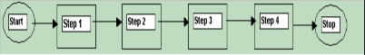
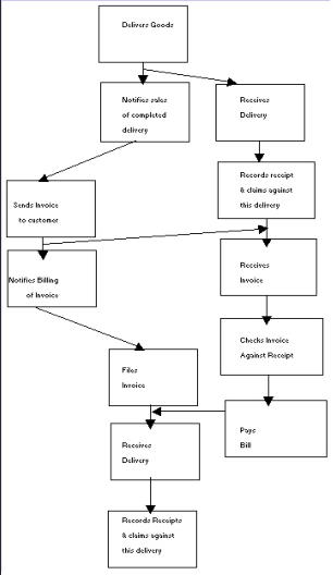
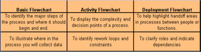
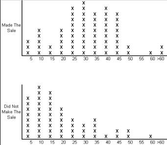
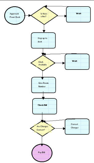
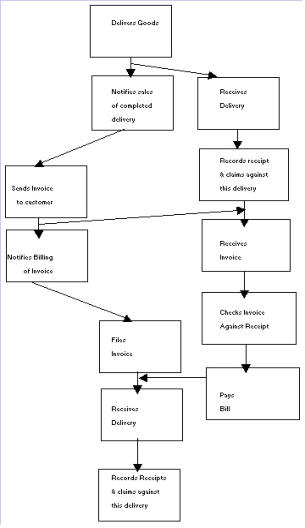
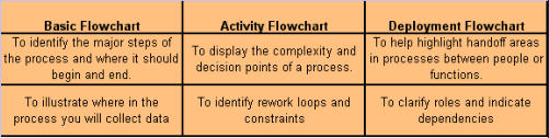
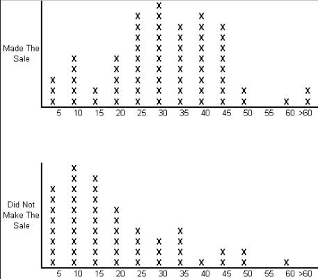
Verifying Causes A lot of thinking and effort goes into constructing a cause-and-effect diagram, however, these diagrams only identify the possible causes. You also need to collect data to confirm which potential cause actually contributes to the problem. Which causes to verify: You likely identified many potential causes on your cause-and-effect diagram or other tool. Now you need to set priorities and collect data on only the most likely causes. Mark on the diagram which potential causes you want to verify. In order to set priorities you should: · Review all the potential causes. · Identify which are the most likely contributors to the problem. · Consider how measurable each of these likely contributors are. · Consider which of the causes you should take action on. · If these considerations don't help you narrow the list significantly, have each team member vote on the top two or three choices. In general, it pays to focus on the causes you can most easily collect data on. However, some important causes may be hard to measure or observe, and you may need to be creative in coming up with ways to get data for some of those causes. Often, performing a simple experiment (where you change the targeted factor and observe the effect) will help you determine the best course of action. Knowing which potential causes you could really change will also help you focus your efforts. It doesn't help to put a lot of effort into gathering data on something that you have no control over or cannot change. Testing a theory with data: · The potential cause is really a theory that two factors, or a cause and an effect, are related to each other. · You need data to verify whether the cause and the effect relationship really exists. · You can analyze existing data to test that theory, or collect new data. Analyzing cause-and-effect data will be easier if you know which tool to use. The type of data you will collect determines what tools you can use. The FOCUS of the Analyze phase is: Y = f(X1, X2, X3…..Xn) where Y is the output or effect and the X's are the input and process variables that drive Y. The main question to be answered in the Analyze phase is, "What vital few process and input variables affect CTQ (critical-to-quality) process performance or output measures?" Process or Data Door It is recommended to go through both doors to make sure that the potential causes are not overlooked. Process Door - Detailed Process Maps, Value Added Analysis, Cycle Time Analysis. · To improve the understanding of process flow. · To tackle cycle-time problems. · To identify opportunities to reduce process costs. Data Door - Stratification, Scatter Diagrams, Multi-vari Plots · To understand the drivers of variation in the process. · To tackle quality problems and waste. · To understand the root cause of difference between outputs. Process Door Flow diagrams - graphical displays that make a process visible and understandable. Reasons to use them are: · To create a common understanding. · To clarify the steps in a process. · To identify improvement opportunities in a process (complexity, waste, delays, inefficiencies and constraints). · To uncover problems within the process. · To reveal how the process operates. When should you use a flow diagram? · To create a common understanding. · To clarify steps in a process. · To build consensus on how a process actually operates and how it should operate. · To understand the cause of common problems with how all units are processed. Types of Flow Diagrams Basic or high-level flow diagram. Activity Flow Diagrams These are specific about what happens in a process. They often capture decision points, rework loops, complexity, logic, and so forth. Deployment Flow Diagrams These types of diagrams reveal the detailed steps in a process, and depict which people or groups are involved in each step. Which flow diagram technique should I use? How to create a flow diagram - When creating a flowchart, work with a group so that you can met multiple viewpoints. 1. Brainstorm action steps. a. Write these on post-it notes and place on the wall or use a flipchart. b. Make sure you include the steps that occur when things go wrong. 2. Arrange the steps in sequence. a. Be consistent in the direction of flow - time should always flow from top to bottom, or left to right. b. Use appropriate flowchart symbols that everyone knows - use standard symbols. 3. Check for missing steps or decision points. 4. Number the steps Value-Added and Non-Value-Added Steps Value Added Steps 1. Customers are willing to pay for it. 2. It physically changes the product. 3. It's done right the first time, every time. Non-Value Added Steps · Are not essential to produce output. · Do not add value to the output. · Include: · Defects, errors, omissions · Preparation/setup, control/inspection · Over-production, processing, inventory · Transporting, motion, waiting, delays CYCLE-TIME REDUCTION Understanding Cycle Time: · Provides a better understanding of the process. · Shows the impact of non-value-added steps on the time to produce product or service. · Identifies bottlenecks or constraints in the process. Reducing Cycle Time: · Helps increase predictability in the process. · Helps reduce waste and rework, which reduces costs. · Provides a competitive advantage by reducing cycle time. When analyzing cycle time, focus on the "thing" or object and not on the people. Process Analysis Review: · Create an activity or deployment flowchart to map out the steps. · Use opportunity flowcharts or other approaches to identify waste and complexity. · Measure cycle time so you can calculate both value-added and non-value-added time. · Identify the constraints or bottlenecks: · Any resource whose capacity limits the amount of information or material that flows thru the process. · Any resource whose capacity is equal to or less than the demand placed upon it. DATA DOOR Stratified Frequency Plots - When one variable has continuous data and another has attribute or discrete data, the best option for analyzing results is stratified frequency plots. · Gather continuous data for each of the attribute types or categories. Collect data on number of defects for each of the four different types of customized orders. · Create a frequency plot for each category. Use the same numeric scale and plot size for each plot so you can easily compare multiple plots. · Look for patterns. Discrete X and Continuous Y THEORY - Variation in training, technique and procedures at different locations accounts for much of the variation in how long it takes to complete a function. For example - oil changes/lubes. DATA - Measure time needed to complete a lube job at different locations. Cause (X) = discrete data (location). Effect (Y) = continuous data on time needed to complete oil change/lube. In the example above, the lubes done at location B are generally faster than those completed at location A or location C. The next step for this company would be to see if they can discover the cause for these differences. Continuous X and Discrete Y THEORY - The more time spent with a customer, the more likely you will make a sale. DATA - Measure the time spent with the customer and separate into two categories (Made the sale vs. Didn't make the sale). The above example illustrates that most of the sales were made when the sales representative spent 25 to 45 minutes with the customer. Most non-sales occurred when the sales representative spent 20 minutes or less with the customer. CONTINUE TO PART TWO OF ANALYZE NEXT- - PART TWO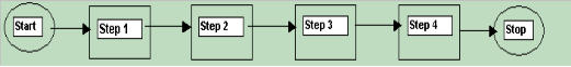


STEP #3 - ANALYZE
ORGANIZE & ANALYZE DATA

Step #3 - ANALYZE
The MEASURE phase produced the baseline performance of the process. Having stratified the data in the baseline performance, it became possible to pinpoint the location or source of the problems by building a factual understanding of the existing process conditions and problems, which will help to focus the problem statement. In the ANALYZE phase, you will develop theories of root causes, confirm the theories with data, and finally identify the root cause(s) of the problem. The verified cause(s) will then form the basis for your solutions in the next phase - IMPROVE. The tools used most commonly in the Analyze phase are: · Affinity Diagrams - was covered in the Define phase. · Brainstorming · Cause-and-Effect Diagrams · Control Charts - covered in the Measure Phase · Data Collection Forms - covered in the Measure Phase · Data Collection Plan - covered in the Measure Phase · Design of Experiments · Flow Diagrams · Frequency Plots - covered in the Measure Phase · Hypothesis Tests · Pareto Charts - covered in the Measure Phase · Regression Analysis · Response Surface Methodology · Sampling - covered in the Measure Phase · Scatter Plots · Stratified Frequency Plots Organizing Potential Causes Once the problem has been focused, the team will create a list of potential causes and then set out to organize those causes in order to see any potential relationship between cause and effect. An underlying assumption of many of the tools used in the Analyze phase is that the data roughly fits a normal distribution. Causes are verified so that improvements focus on the deep cause, not on the original symptom. Thus, the next step is to generate a lot of potential causes, organize them, and decide which potential causes to verify. Brainstorming In the Analyze phase, brainstorming is used to generate a lot of ideas quickly to identify potential causes. Brainstorming encourages creativity, involves everyone, generates excitement and energy, and separates people form the ideas they suggest. The important thing to remember is that to NEVER downplay anyone's ideas. Remember that every thought or idea suggested should be placed on the board, regardless of how inappropriate it may seem at first. Brainstorming Methods - two main methods employed: · Rounds - go around in turn, one item per turn, until everyone passes or has no further idea to input. · Popcorn - anyone calls out ideas, no order, until all ideas are out and none remain to be offered. Guidelines: · Start with silent "think" time · Freewheel - don't hold back. · NO CRITICISM of any idea. · Hitchhike - build upon other ideas or suggestions. · The more ideas, the better · Post ideas using post-it notes. The Five Whys To push to reach the root cause, start with the focused problem statement and then ask why at least five times. An example of a problem statement is "customers complain about waiting too long to get connected to staff during lunch hours." Thus the scenario on the chalkboard would be: WHY does this problem happen? Backup operators take longer to connect callers. WHY does it take backup operators longer? Backup operators don't know the job as well as the regular operator/receptionist does. WHY don't backup operators know the job as well? There is no special training, no job aids to make up for the gap in experience and on-the-job training for them. WHY isn't there special training or job aids? In the past, the organization has not recognized this as a problem. WHY hasn't the organization recognized this as a problem? The organization has no system to identify training needs. Graphic displays can help you structure possible causes in order to find relationships that will shed new light on the problem. Most people have had the experience of "solving" a problem over and over again; however, the actions taken were merely attacking the same problem repeatedly and not actually finding the root cause. Use of a cause-and-effect (or "fishbone") and a tree diagram can help make your solutions more effective the first time around by making sure that you reveal the actual deep causes of a problem. Cause-and-Effect Diagram Again I refer you to the Cause-and-Effect Diagram within this web site: Cause-and-effect diagrams graphically display potential causes of a problem. The layout shows the cause-and-effect relationship between the potential causes. Why use cause-and-effect diagrams? · To stimulate thinking during a brainstorm session for potential causes. · To understand relationships between potential causes. · To track which potential causes have been investigated, and which proved to contribute significantly to the problem. It is common for people working on improvement efforts to jump to conclusions without studying the causes, target one possible cause while at the same time, ignoring other potential causes, thus the aim has been at the surface symptom. Cause- and-effect diagrams are designed to help alleviate that tendency by: · Providing a structure to understand the relationships between many possible causes of a problem, rather than only one. · Giving people a framework for planning what data to collect. · Serving as a visual display of causes that have been studied. · Helping team members communicate within the team and with the rest of the organization.When to use a cause-and-effect diagram?
1.
A large number of potential causes makes it
difficult to focus the analysis.
2.
there is lack of clarity about the relationship
between different potential causes.
How to construct a cause-and-effect diagram.
1.
Review the focused problem statement.
2.
Identify possible causes.
3.
Sort possible causes into reasonable
clusters.
4.
Choose a cluster and label a main one.
5.
Develop and arrange bones for that
particular cluster.
6.
Develop other main bones for other cluster
ideas.
7.
Add title, date, and contact person.
8.
Select possible causes to verify with data.
Verifying Causes A lot of thinking and effort goes into constructing a cause-and-effect diagram, however, these diagrams only identify the possible causes. You also need to collect data to confirm which potential cause actually contributes to the problem. Which causes to verify: You likely identified many potential causes on your cause-and-effect diagram or other tool. Now you need to set priorities and collect data on only the most likely causes. Mark on the diagram which potential causes you want to verify. In order to set priorities you should: · Review all the potential causes. · Identify which are the most likely contributors to the problem. · Consider how measurable each of these likely contributors are. · Consider which of the causes you should take action on. · If these considerations don't help you narrow the list significantly, have each team member vote on the top two or three choices. In general, it pays to focus on the causes you can most easily collect data on. However, some important causes may be hard to measure or observe, and you may need to be creative in coming up with ways to get data for some of those causes. Often, performing a simple experiment (where you change the targeted factor and observe the effect) will help you determine the best course of action. Knowing which potential causes you could really change will also help you focus your efforts. It doesn't help to put a lot of effort into gathering data on something that you have no control over or cannot change. Testing a theory with data: · The potential cause is really a theory that two factors, or a cause and an effect, are related to each other. · You need data to verify whether the cause and the effect relationship really exists. · You can analyze existing data to test that theory, or collect new data. Analyzing cause-and-effect data will be easier if you know which tool to use. The type of data you will collect determines what tools you can use. The FOCUS of the Analyze phase is: Y = f(X1, X2, X3…..Xn) where Y is the output or effect and the X's are the input and process variables that drive Y. The main question to be answered in the Analyze phase is, "What vital few process and input variables affect CTQ (critical-to-quality) process performance or output measures?" Process or Data Door It is recommended to go through both doors to make sure that the potential causes are not overlooked. Process Door - Detailed Process Maps, Value Added Analysis, Cycle Time Analysis. · To improve the understanding of process flow. · To tackle cycle-time problems. · To identify opportunities to reduce process costs. Data Door - Stratification, Scatter Diagrams, Multi- vari Plots · To understand the drivers of variation in the process. · To tackle quality problems and waste. · To understand the root cause of difference between outputs. Process Door Flow diagrams - graphical displays that make a process visible and understandable. Reasons to use them are: · To create a common understanding. · To clarify the steps in a process. · To identify improvement opportunities in a process (complexity, waste, delays, inefficiencies and constraints). · To uncover problems within the process. · To reveal how the process operates. When should you use a flow diagram? · To create a common understanding. · To clarify steps in a process. · To build consensus on how a process actually operates and how it should operate. · To understand the cause of common problems with how all units are processed. Types of Flow Diagrams Basic or high-level flow diagram. Activity Flow Diagrams These are specific about what happens in a process. They often capture decision points, rework loops, complexity, logic, and so forth. Deployment Flow Diagrams These types of diagrams reveal the detailed steps in a process, and depict which people or groups are involved in each step. Which flow diagram technique should I use? How to create a flow diagram - When creating a flowchart, work with a group so that you can met multiple viewpoints. 1. Brainstorm action steps. a. Write these on post-it notes and place on the wall or use a flipchart. b. Make sure you include the steps that occur when things go wrong. 2. Arrange the steps in sequence. a. Be consistent in the direction of flow - time should always flow from top to bottom, or left to right. b. Use appropriate flowchart symbols that everyone knows - use standard symbols. 3. Check for missing steps or decision points. 4. Number the steps Value-Added and Non-Value-Added Steps Value Added Steps 1. Customers are willing to pay for it. 2. It physically changes the product. 3. It's done right the first time, every time. Non-Value Added Steps · Are not essential to produce output. · Do not add value to the output. · Include: · Defects, errors, omissions · Preparation/setup, control/inspection · Over-production, processing, inventory · Transporting, motion, waiting, delays CYCLE-TIME REDUCTION Understanding Cycle Time: · Provides a better understanding of the process. · Shows the impact of non-value-added steps on the time to produce product or service. · Identifies bottlenecks or constraints in the process. Reducing Cycle Time: · Helps increase predictability in the process. · Helps reduce waste and rework, which reduces costs. · Provides a competitive advantage by reducing cycle time. When analyzing cycle time, focus on the "thing" or object and not on the people. Process Analysis Review: · Create an activity or deployment flowchart to map out the steps. · Use opportunity flowcharts or other approaches to identify waste and complexity. · Measure cycle time so you can calculate both value-added and non-value-added time. · Identify the constraints or bottlenecks: · Any resource whose capacity limits the amount of information or material that flows thru the process. · Any resource whose capacity is equal to or less than the demand placed upon it. DATA DOOR Stratified Frequency Plots - When one variable has continuous data and another has attribute or discrete data, the best option for analyzing results is stratified frequency plots. · Gather continuous data for each of the attribute types or categories. Collect data on number of defects for each of the four different types of customized orders. · Create a frequency plot for each category. Use the same numeric scale and plot size for each plot so you can easily compare multiple plots. · Look for patterns. Discrete X and Continuous Y THEORY - Variation in training, technique and procedures at different locations accounts for much of the variation in how long it takes to complete a function. For example - oil changes/lubes. DATA - Measure time needed to complete a lube job at different locations. Cause (X) = discrete data (location). Effect (Y) = continuous data on time needed to complete oil change/lube. In the example above, the lubes done at location B are generally faster than those completed at location A or location C. The next step for this company would be to see if they can discover the cause for these differences. Continuous X and Discrete Y THEORY - The more time spent with a customer, the more likely you will make a sale. DATA - Measure the time spent with the customer and separate into two categories (Made the sale vs. Didn't make the sale). The above example illustrates that most of the sales were made when the sales representative spent 25 to 45 minutes with the customer. Most non-sales occurred when the sales representative spent 20 minutes or less with the customer. CONTINUE TO PART TWO OF ANALYZE NEXT- - PART TWO
© The Quality Web, authored by Frank E. Armstrong, Making Sense
Chronicles - 2003 - 2016