Lesson #6 - Tool #3 - The Histogram
The histogram shows us the dispersion of a process


© The Quality Web, authored by Frank E. Armstrong, Making Sense Chronicles - 2003 - 2016
WHY A HISTOGRAM IS IMPORTANT
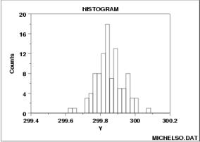
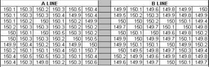
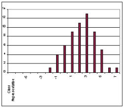
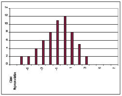
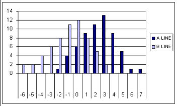
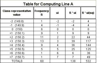
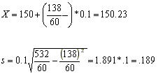
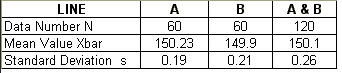
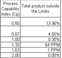
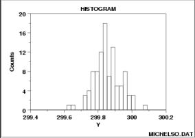
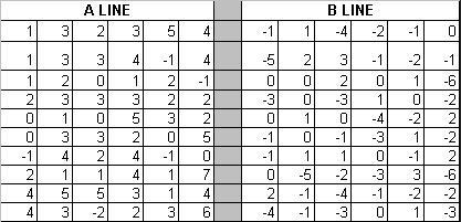
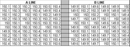
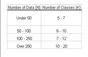
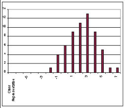
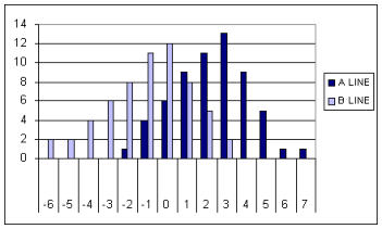
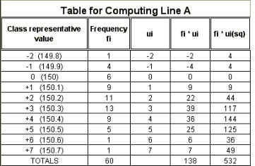
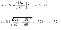
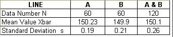
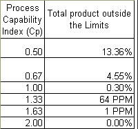
The common person believes that if a part is made in mass production from a machine, all of the parts will be exactly alike. The truth is that even with the best of machines and processes, no two parts are exactly the same. The product will have a main or "mean" specification limit, with plus/minus tolerance that states that as long as the part is produced within this range, to that range, it is an acceptable part. The object is to hit the target specification, however, that is not always totally possible The purpose of a Histogram is to take the data that is collected from a process and then display it graphically to view how the distribution of the data, centers itself around the mean, or main specification. From the data, the histogram will graphically show: 1. The center of the data. 2. The spread of the data. 3. Any data skewness (slant, bias or run at an angle). 4. The presence of outliers (product outside the specification range). 5. The presence of multiple modes (or peaks) within the data. Below, you will see an example of a histogram. Notice that there is one main peak, but also two secondary peaks on either side of the main peak. The easiest way to explain how a histogram is formed is to say that the form is obtained by splitting the range of the data, into equal-sized bins (called classes). Then, for each bin, the number of points from the data set that fall into each bin, is counted. The best way to understand how the histogram is formed is to actually prepare one, so you should try to do the same as you follow along. We will use the data listed in figure 6 for our exercise. This data represents the measurements taken from a process that makes machine parts, produced on Line A and Line B. The specification is listed as 150 ± 0.5 mm. The values on this chart were arrived at by subtracting 150mm from the measured value, and then multiplying by 10. For example, a measurement of 149.9 - 150 would equal -.10; multiplied by 10 would equal -1 We will now make a histogram of the data listed below, and compare the parts produced on Line A and Line B, and then overlay the two together. Figure 6 We could have also used the exact measurements which is reflected in figure 8 below, however, to keep this exercise simple, I wanted to deal with whole numbers. Figure 8 below is the exact measurments taken that we converted to figure 6. Figure 8 STEPS TO CREATING A HISTOGRAM STEP #1 - Count the data, in this case N=60. STEP #2 - On the data in figure 6 above, looking only at Line A right now, find the largest value and call that XL, and then find the smallest value, calling that XS. On Line A, the largest value is "7" and the smallest is "- 2". STEP #3 - Next, find the range of the data. R = XL - XS, or 7 - ( - 2 ), or R = 9. STEP #4 - Determine the width of the class. The total data measurements equals 60 (N), the measurement unit is 1, and the range is 9 (R). There is a formula table listed below that will help you determine the number of classes to be used: Figure 7 STEP #5 - The class interval (h), which is used as the horizontal graduation unit for the histogram, is determined by dividing the range (R) by the number of classes. For simplicity sake, since the range is 9, and from our table in figure 7, we can have 6 - 10 classes, we will choose 9 classes; thus 9 divided by 9 = 1. Each class value will be worth One (1). HISTOGRAM EXERCISE Plot data from Lines A & B from Figure 8, on the Manual Graph I provide (CLICK HERE FOR THE EXCEL GRAPH). In this first exercise, I want you to put an "X" or "1" in the manual graph for Line A data above in the left side of the form under the column "Tally". Make a mark in the appropriate row for every data point in Line A, and then do the same for Line B. Then I want you to put the same mark for Line B data above in the right side of the form under the column "Tally". Total the number of occurrence for each number in the column marked "Frequency", and then add the frequency for A and B and put that number in the column marked A + B frequency. When you are finished, your form should look like THIS (CLICK HERE) when completed. When you look at your graph on the form you just completed, you actually have a histogram of both Line A and Line B. If you were to plot those numbers on an Excel bar graph, they would look like this: Figure 9 - LIne A Histogram Figure 10 - Line B Histogram Remember that the specification was 150.0 ± 0.5 mm, therefore, any plot on either graph that is more than + 5 or less than - 5 is a non-conforming product and is unacceptable. Visually, by comparing both histograms, you can see that Line A has a shift to the right of the center line specification (150.0). Line B has a shift to the left. HISTOGRAM EXERCISE 2 The next exercise what I want you to do is to take the total of Line A & B and plot that histogram. From your first exercise sheet, you added A + B and put that number in the far right column. Use the attached HISTOGRAM FORM to make your plots, put a "X" in each square. I have already put the totals from your first sheet in the Frequency column. If we were to overlay both graphs, or plot both sets together, the histogram would look like figure 11, and your form should look just like this. Figure 11 - Combined Histogram of Line A & B UNDERSTANDING THE HISTOGRAM LINE A - If we review the histogram for Line A, you will see that the most recorded value is 3, or +3 (150.3mm); further, that all 60 data points are from - 2 to +7, or from 149.8 to 150.7mm. There is a shift toward the (+) side of 150.0, and we have two parts that are out of specification range (larger than +5mm). LINE B - If we review the historgram for Line B, you will see that most of the values are at either 0 (150.0) or at - 1 (149.9mm). Line B also has a shift, but it is more toward the (-) side of the spec, or less than 150.0mm. There are also two parts out of specification range (beyond the -5 specification). Now when we look at the combined run of parts of the two lines, you can see a more even distribution spread across the specfication tolerance range (that is, between the range of 149.5 and 150.5mm). Since there is such a wide dispersion of parts, there is no smooth "bell curve" appearance like there was in the sample histogram at the start of this lesson. As a matter of fact, this chart reveals a multi-peaked histogram that strongly indicates the process is not centered, if all these parts were produced on the same line. Since these parts were produced on two separate lines, we can actually see that Line A needs an adjustment to bring it more to the center of the spec by decreasing the process value. Line B needs an adjustment to center the spec by increasing the process value. COMPUTING THE MEAN AND THE STANDARD DEVIATION To calculate the mean (Xbar), or average value, and the standard deviation to be used for further statistical computations, we will use the below chart for Line A. The standard deviation is a measure of variability. Data is always scattered around the zone of central tendency, and the extent of this scatter is called dispersion or variation. Range is a simple method of measuring variance, but the most important measure is the Standard Deviation. The Standard Deviation is the square root of the population variance. To understand the chart, the left column is the actual value recorded on the right, and the "ui" factor on the left of the measurment. The next column (fi) indicates how many times each value was recorded from the data taken. The third column (ui) is the value indicated in the first column, to the left of the actual measurement, or the class representative value in converted form. The fourth column is the second column multiplied by the third column, (fi * ui). For example, 1 times - 2 = -2. The fifth column is a little tricky. You take the "fi" value and multiply it by the square of "ui" (for example -2 * -2 = 4, times 1 = 4). Once you have all those values calculated, you add the totals for each column of fi, fi*ui, and the fi*ui2 (squared). EXERCISE 3: I have done Line A for you. Now, you need to practice by doing Line B, and then also by computing the values for the combined Line A & Line B. Use the following BLANK FORMS to do your calculations. I have provided the initial numbers for you. After you have completed the exercise, you may select Exercise 3 below (see Check Your Work) and compare your results. Now to compute Xbar and the Standard Deviation (s) from the table of Line A, we use the following formula: To explain the above formula, 150 is the specification value. 138 is the total of the column fi * ui, and 60 is the total number of measurements taken (N). 0.1 is the formula factor. In the standard deviation formula, 532 is the total of the column fi * ui square. Thus, the mean = 150.23, and the standard deviation = .19 (.189 rounded up to .19) for LINE A. EXERCISE 4: You have already calculated the information on the previous form for Line B and the Combined Line A & B. Now it is time for you to COMPUTE THE MEAN and STANDARD DEVIATION for LINE B and for the combined LINE A & B. To help ensure that you are on the right track, I have given you the answers below. However, you still need to do the actual calculations for practice to ensure you understand how to get the right answers. THE PROCESS CAPABILITY With the specification of 150 ± 0.5 mm, the width of the class, or class interval, is 1 mm. This is five times the standard deviation (s) of Line A and five times the standard deviation (s) of Line B; four times the standard deviation (s) of A & B combined. In order for products to remain within specification, the width of a class should be at least SIX TIMES the Standard Deviation (s). The Process Capability Index (Cp), is a value indicating how capable a process is of producing product without many defects. The higher the process capability index, the better the process is centered around the mean specification and the less possibility of defects. With reference to the process capability index (Cp), it can be expressed as follows: Cp = width of class > 1 6s For Line A Cp = 1.0 / 6 * .19 = 1.0 / 1.14 = .87 Cp. For Line B Cp = 1.0 / 6 * .21 = 1.0 / 1.25 = .79 Cp. For Line A & B Combined Cp = 1.0 / 6 * .26 = 1.0 / 1.56 = .64 Cp. While both lines exhibit that the products produced are close to the center of the specification, both of the indexes are less than 1, so this indicates that there will be defectives produced. Notice that when you combine both Line A and Line B, you have defectives on both sides of the specification, and thus the defectives produced actually increases, therefore the Cp drops even lower. For a process to be suitable, it should have a Cp greater than 1.0. The higher the number, the better the process is centered. In the chart below, you can see the Cp, or Process Capability Index relative to the total product outside the two-sided specification limits, or +/- tolerance. What can we do to eliminate the defectives and improve the process capability? Find out the reason for the difference in production between A & B lines, and try to eliminate or standardize the production in both lines. Determine how to get Lines A & B to produce more towards the center of the specification center. Determine how to center the specification and decrease the dispersion. Check machinery, materials, workers, work methods, and measurement methods. CHECK YOUR WORK Check your results on Exercise 3 here.


Lesson #6 - Tool #3 - The
Histogram
The histogram shows us the dispersion of a
process


© The Quality Web, authored by Frank E. Armstrong, Making Sense
Chronicles - 2003 - 2016
WHY A HISTOGRAM IS IMPORTANT
The common person believes that if a part is made in mass production from a machine, all of the parts will be exactly alike. The truth is that even with the best of machines and processes, no two parts are exactly the same. The product will have a main or "mean" specification limit, with plus/minus tolerance that states that as long as the part is produced within this range, to that range, it is an acceptable part. The object is to hit the target specification, however, that is not always totally possible The purpose of a Histogram is to take the data that is collected from a process and then display it graphically to view how the distribution of the data, centers itself around the mean, or main specification. From the data, the histogram will graphically show: 1. The center of the data. 2. The spread of the data. 3. Any data skewness (slant, bias or run at an angle). 4. The presence of outliers (product outside the specification range). 5. The presence of multiple modes (or peaks) within the data. Below, you will see an example of a histogram. Notice that there is one main peak, but also two secondary peaks on either side of the main peak. The easiest way to explain how a histogram is formed is to say that the form is obtained by splitting the range of the data, into equal-sized bins (called classes). Then, for each bin, the number of points from the data set that fall into each bin, is counted. The best way to understand how the histogram is formed is to actually prepare one, so you should try to do the same as you follow along. We will use the data listed in figure 6 for our exercise. This data represents the measurements taken from a process that makes machine parts, produced on Line A and Line B. The specification is listed as 150 ± 0.5 mm. The values on this chart were arrived at by subtracting 150mm from the measured value, and then multiplying by 10. For example, a measurement of 149.9 - 150 would equal -.10; multiplied by 10 would equal -1 We will now make a histogram of the data listed below, and compare the parts produced on Line A and Line B, and then overlay the two together. Figure 6 We could have also used the exact measurements which is reflected in figure 8 below, however, to keep this exercise simple, I wanted to deal with whole numbers. Figure 8 below is the exact measurments taken that we converted to figure 6. Figure 8 STEPS TO CREATING A HISTOGRAM STEP #1 - Count the data, in this case N=60. STEP #2 - On the data in figure 6 above, looking only at Line A right now, find the largest value and call that XL, and then find the smallest value, calling that XS. On Line A, the largest value is "7" and the smallest is "- 2". STEP #3 - Next, find the range of the data. R = XL - XS, or 7 - ( - 2 ), or R = 9. STEP #4 - Determine the width of the class. The total data measurements equals 60 (N), the measurement unit is 1, and the range is 9 (R). There is a formula table listed below that will help you determine the number of classes to be used: Figure 7 STEP #5 - The class interval (h), which is used as the horizontal graduation unit for the histogram, is determined by dividing the range (R) by the number of classes. For simplicity sake, since the range is 9, and from our table in figure 7, we can have 6 - 10 classes, we will choose 9 classes; thus 9 divided by 9 = 1. Each class value will be worth One (1). HISTOGRAM EXERCISE Plot data from Lines A & B from Figure 8, on the Manual Graph I provide (CLICK HERE FOR THE EXCEL GRAPH). In this first exercise, I want you to put an "X" or "1" in the manual graph for Line A data above in the left side of the form under the column "Tally". Make a mark in the appropriate row for every data point in Line A, and then do the same for Line B. Then I want you to put the same mark for Line B data above in the right side of the form under the column "Tally". Total the number of occurrence for each number in the column marked "Frequency", and then add the frequency for A and B and put that number in the column marked A + B frequency. When you are finished, your form should look like THIS (CLICK HERE) when completed. When you look at your graph on the form you just completed, you actually have a histogram of both Line A and Line B. If you were to plot those numbers on an Excel bar graph, they would look like this: Figure 9 - LIne A Histogram Figure 10 - Line B Histogram Remember that the specification was 150.0 ± 0.5 mm, therefore, any plot on either graph that is more than + 5 or less than - 5 is a non-conforming product and is unacceptable. Visually, by comparing both histograms, you can see that Line A has a shift to the right of the center line specification (150.0). Line B has a shift to the left. HISTOGRAM EXERCISE 2 The next exercise what I want you to do is to take the total of Line A & B and plot that histogram. From your first exercise sheet, you added A + B and put that number in the far right column. Use the attached HISTOGRAM FORM to make your plots, put a "X" in each square. I have already put the totals from your first sheet in the Frequency column. If we were to overlay both graphs, or plot both sets together, the histogram would look like figure 11, and your form should look just like this. Figure 11 - Combined Histogram of Line A & B UNDERSTANDING THE HISTOGRAM LINE A - If we review the histogram for Line A, you will see that the most recorded value is 3, or +3 (150.3mm); further, that all 60 data points are from - 2 to +7, or from 149.8 to 150.7mm. There is a shift toward the (+) side of 150.0, and we have two parts that are out of specification range (larger than +5mm). LINE B - If we review the historgram for Line B, you will see that most of the values are at either 0 (150.0) or at - 1 (149.9mm). Line B also has a shift, but it is more toward the (-) side of the spec, or less than 150.0mm. There are also two parts out of specification range (beyond the -5 specification). Now when we look at the combined run of parts of the two lines, you can see a more even distribution spread across the specfication tolerance range (that is, between the range of 149.5 and 150.5mm). Since there is such a wide dispersion of parts, there is no smooth "bell curve" appearance like there was in the sample histogram at the start of this lesson. As a matter of fact, this chart reveals a multi-peaked histogram that strongly indicates the process is not centered, if all these parts were produced on the same line. Since these parts were produced on two separate lines, we can actually see that Line A needs an adjustment to bring it more to the center of the spec by decreasing the process value. Line B needs an adjustment to center the spec by increasing the process value. COMPUTING THE MEAN AND THE STANDARD DEVIATION To calculate the mean (Xbar), or average value, and the standard deviation to be used for further statistical computations, we will use the below chart for Line A. The standard deviation is a measure of variability. Data is always scattered around the zone of central tendency, and the extent of this scatter is called dispersion or variation. Range is a simple method of measuring variance, but the most important measure is the Standard Deviation. The Standard Deviation is the square root of the population variance. To understand the chart, the left column is the actual value recorded on the right, and the "ui" factor on the left of the measurment. The next column (fi) indicates how many times each value was recorded from the data taken. The third column (ui) is the value indicated in the first column, to the left of the actual measurement, or the class representative value in converted form. The fourth column is the second column multiplied by the third column, (fi * ui). For example, 1 times - 2 = -2. The fifth column is a little tricky. You take the "fi" value and multiply it by the square of "ui" (for example -2 * -2 = 4, times 1 = 4). Once you have all those values calculated, you add the totals for each column of fi, fi*ui, and the fi*ui2 (squared). EXERCISE 3: I have done Line A for you. Now, you need to practice by doing Line B, and then also by computing the values for the combined Line A & Line B. Use the following BLANK FORMS to do your calculations. I have provided the initial numbers for you. After you have completed the exercise, you may select Exercise 3 below (see Check Your Work) and compare your results. Now to compute Xbar and the Standard Deviation (s) from the table of Line A, we use the following formula: To explain the above formula, 150 is the specification value. 138 is the total of the column fi * ui, and 60 is the total number of measurements taken (N). 0.1 is the formula factor. In the standard deviation formula, 532 is the total of the column fi * ui square. Thus, the mean = 150.23, and the standard deviation = .19 (.189 rounded up to .19) for LINE A. EXERCISE 4: You have already calculated the information on the previous form for Line B and the Combined Line A & B. Now it is time for you to COMPUTE THE MEAN and STANDARD DEVIATION for LINE B and for the combined LINE A & B. To help ensure that you are on the right track, I have given you the answers below. However, you still need to do the actual calculations for practice to ensure you understand how to get the right answers. THE PROCESS CAPABILITY With the specification of 150 ± 0.5 mm, the width of the class, or class interval, is 1 mm. This is five times the standard deviation (s) of Line A and five times the standard deviation (s) of Line B; four times the standard deviation (s) of A & B combined. In order for products to remain within specification, the width of a class should be at least SIX TIMES the Standard Deviation (s). The Process Capability Index (Cp), is a value indicating how capable a process is of producing product without many defects. The higher the process capability index, the better the process is centered around the mean specification and the less possibility of defects. With reference to the process capability index (Cp), it can be expressed as follows: Cp = width of class > 1 6s For Line A Cp = 1.0 / 6 * .19 = 1.0 / 1.14 = .87 Cp. For Line B Cp = 1.0 / 6 * .21 = 1.0 / 1.25 = .79 Cp. For Line A & B Combined Cp = 1.0 / 6 * .26 = 1.0 / 1.56 = .64 Cp. While both lines exhibit that the products produced are close to the center of the specification, both of the indexes are less than 1, so this indicates that there will be defectives produced. Notice that when you combine both Line A and Line B, you have defectives on both sides of the specification, and thus the defectives produced actually increases, therefore the Cp drops even lower. For a process to be suitable, it should have a Cp greater than 1.0. The higher the number, the better the process is centered. In the chart below, you can see the Cp, or Process Capability Index relative to the total product outside the two-sided specification limits, or +/- tolerance. What can we do to eliminate the defectives and improve the process capability? Find out the reason for the difference in production between A & B lines, and try to eliminate or standardize the production in both lines. Determine how to get Lines A & B to produce more towards the center of the specification center. Determine how to center the specification and decrease the dispersion. Check machinery, materials, workers, work methods, and measurement methods. CHECK YOUR WORK Check your results on Exercise 3 here.