


© The Quality Web, authored by Frank E. Armstrong, Making Sense Chronicles - 2003 - 2016
Lesson #4 - Tool #1 - The Check Sheet
Tool #1 - The Check Sheet
As previously mentioned, the intent and purpose of collecting data is to either control the production process, to see
the relationship between cause-and-effect, or for the continuous improvement of those processes that produce any
type of defect or nonconforming product. A Check Sheet is used for the purpose of collecting data to compile in such
a way as to be easily used, understood and analyzed automatically. The Check Sheet, as it is being completed,
actually becomes a graphical representation of the data you are collecting, thus you do NOT need any computer
software, or spreadsheet to record the data. It can be simply done with pencil and paper! Check sheets have the
following main functions:
1.
Production process distribution checks - where the distribution lies.
2.
Defective item checks - to determine what kind of defects exist in the process.
3.
Defect location checks - to determine where the common defects on a part are located.
4.
Defective cause checks - type of defect and thus validate the cause thereof.
5.
Check-up confirmation checks - final phase of assembly to check the finished product or work.
The methods that we will concentrate on and utilize here will be for Production Process distribution and defective
item checks. We will discuss the use and relevance of each individually.
Defective Item Check Sheet
In order to reduce the number of defectives produced, it is necessary to know what kind of defects were produced
and the percentage in relation to production. Since every defect has a different cause, it is useless to just list the total
number of defects, therefore, we have to find the number of defects caused by each category, and then we have to
decide the appropriate action to take to resolve those defects. The appropriate action to take is to pick the top two or
three problem areas, and then focus to resolve them.
In our example, we have charted some defects from an alternator production line. (To view our example please click
HERE). Whenever a defect was discovered, the operator would make an entry in the appropriate column, an "X",
check mark or merely a single line for each occurrence. At the end of the day, it can be easily determined what the
main problem was for that day just by looking at the graph that was created from the recorded marks. If this is done
every day, and on every shift, over the course of a week we can tell what the common problems were, and what
problems seemed to be our biggest headache that requires our primary focus.
However, it is worth noting that the defects attained on one line, may not be the same as those encountered on
another line and similar production line. It may also be that the defects experienced on the day shift, may not be the
same defects experienced on the night shift, on the same line and with the same product. Different people, different
products, time and temperature are all factors that could cause a different set of circumstances for defects to occur.
For that reason, each shift or each line, should have it's own study performed.
Once the shift was over and the totals are tallied, you can see from our example that we had two main problems to
focus on. These totals, taken from the 8 main categories, will be charted in a Pareto chart, as you will see when you
visit the Pareto lesson.
Production Process Distribution
The size, weight, or diameter of parts, for example, are known as "continuous data". In a process where these types
of data are gathered, the distribution they provide will often resemble a Histogram (Histogram is Tool #3). A
histogram can be used to investigate the distribution of the process characteristics, and the average value can be
calculated.
If you click HERE, you can see a sample Production Check Sheet.
In this sample sheet, we measured torque readings. The spec limit is 2.2Nm ± .5. From the example sheet, you should
see two dark vertical lines, on the left side it is labeled LSL (Lower Spec Limit) which indicates the 2.2 - .5, or 1.7. On
the right side, another dark line marked USL (Upper Spec Limit) which indicates the 2.2 + .5, or 2.7. All product
readings, or torque readings in this example, that conform (actually good product), need to fall within these limit
boundaries. Anything that is measured outside these limits is termed "Non-Conforming" since they are not within
proper specification limits.
Every time a measurement was taken, an "X", or check mark, was made on the check sheet. From this sample sheet,
you can see where most of the torque readings lie, the consistency of the distribution, and how many are actually
outside the spec limit. What has also been created here on this Check Sheet is a "Histogram". We will discuss
Histograms in a later lesson. Right now, what is important to note from this example chart is that we do not have a
good stable process. The distribution is widespread and not well centered between the specification limits. The
distribution has dual peaks, or is what is known as "bi-modal".
Bi-modal means that there are two points where most of the readings taken are charted, or that is has two peaks.
This means the frequency of readings rises and falls twice, rather than a more proper and even distribution with one
peak.
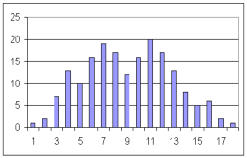
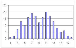
To illustrate further, I have taken the same data and plotted that in a bar graph to show you the physical appearance
just as if it were plotted using Excel. You can see that this looks much like the hand drawn chart that was made in our
example. Notice also that you can see two distinct "peaks" separated by less frequent readings in the middle of the
two peaks.
BLANK PRODUCTION FORMS
For a Blank copy of the Production Process Check Sheet in Excel, Click ON THIS LINK.
For a Blank copy of the Defective Item Check Sheet in Excel, Click ON THIS LINK.


© The Quality Web, authored by Frank E. Armstrong, Making Sense
Chronicles - 2003 - 2016
Lesson #4 - Tool #1 - Check Sheet
Tool #1 - The Check Sheet
As previously mentioned, the intent and purpose of
collecting data is to either control the production process,
to see the relationship between cause-and-effect, or for
the continuous improvement of those processes that
produce any type of defect or nonconforming product. A
Check Sheet is used for the purpose of collecting data to
compile in such a way as to be easily used, understood
and analyzed automatically. The Check Sheet, as it is being
completed, actually becomes a graphical representation of
the data you are collecting, thus you do NOT need any
computer software, or spreadsheet to record the data. It
can be simply done with pencil and paper! Check sheets
have the following main functions:
1.
Production process distribution checks - where the
distribution lies.
2.
Defective item checks - to determine what kind of
defects exist in the process.
3.
Defect location checks - to determine where the
common defects on a part are located.
4.
Defective cause checks - type of defect and thus
validate the cause thereof.
5.
Check-up confirmation checks - final phase of
assembly to check the finished product or work.
The methods that we will concentrate on and utilize here
will be for Production Process distribution and defective
item checks. We will discuss the use and relevance of each
individually.
Defective Item Check Sheet
In order to reduce the number of defectives produced, it is
necessary to know what kind of defects were produced
and the percentage in relation to production. Since every
defect has a different cause, it is useless to just list the
total number of defects, therefore, we have to find the
number of defects caused by each category, and then we
have to decide the appropriate action to take to resolve
those defects. The appropriate action to take is to pick the
top two or three problem areas, and then focus to resolve
them.
In our example, we have charted some defects from an
alternator production line. (To view our example iplease
click HERE). Whenever a defect was discovered, the
operator would make an entry in the appropriate column,
an "X", check mark or merely a single line for each
occurrence. At the end of the day, it can be easily
determined what the main problem was for that day just
by looking at the graph that was created from the
recorded marks. If this is done every day, and on every
shift, over the course of a week we can tell what the
common problems were, and what problems seemed to
be our biggest headache that requires our primary focus.
However, it is worth noting that the defects attained on
one line, may not be the same as those encountered on
another line and similar production line. It may also be
that the defects experienced on the day shift, may not be
the same defects experienced on the night shift, on the
same line and with the same product. Different people,
different products, time and temperature are all factors
that could cause a different set of circumstances for
defects to occur. For that reason, each shift or each line,
should have it's own study performed.
Once the shift was over and the totals are tallied, you can
see from our example that we had two main problems to
focus on. These totals, taken from the 8 main categories,
will be charted in a Pareto chart, as you will see when you
visit the Pareto lesson.
Production Process Distribution
The size, weight, or diameter of parts, for example, are
known as "continuous data". In a process where these
types of data are gathered, the distribution they provide
will often resemble a Histogram (Histogram is Tool #3). A
histogram can be used to investigate the distribution of
the process characteristics, and the average value can be
calculated.
If you click HERE, you can see a sample Production Check
Sheet.
In this sample sheet, we measured torque readings. The
spec limit is 2.2Nm ± .5. From the example sheet, you
should see two dark vertical lines, on the left side it is
labeled LSL (Lower Spec Limit) which indicates the 2.2 - .5,
or 1.7. On the right side, another dark line marked USL
(Upper Spec Limit) which indicates the 2.2 + .5, or 2.7. All
product readings, or torque readings in this example, that
conform (actually good product), need to fall within these
limit boundaries. Anything that is measured outside these
limits is termed "Non-Conforming" since they are not
within proper specification limits.
Every time a measurement was taken, an "X", or check
mark, was made on the check sheet. From this sample
sheet, you can see where most of the torque readings lie,
the consistency of the distribution, and how many are
actually outside the spec limit. What has also been created
here on this Check Sheet is a "Histogram". We will discuss
Histograms in a later lesson. Right now, what is important
to note from this example chart is that we do not have a
good stable process. The distribution is widespread and
not well centered between the specification limits. The
distribution has dual peaks, or is what is known as "bi-
modal".
Bi-modal means that there are two points where most of
the readings taken are charted, or that is has two peaks.
This means the frequency of readings rises and falls twice,
rather than a more proper and even distribution with one
peak.
To illustrate further, I have taken the same data and
plotted that in a bar graph to show you the physical
appearance just as if it were plotted using Excel. You can
see that this looks much like the hand drawn chart that
was made in our example. Notice also that you can see
two distinct "peaks" separated by less frequent readings in
the middle of the two peaks.
For a Blank copy of the Defective Item Check Sheet in
Excel, Click ON THIS LINK.
For a Blank copy of the Production Process Check Sheet in
Excel, Click ON THIS LINK
BLANK PRODUCTION FORMS