STEP #5 - CONTROL
STANDARDIZE & MONITOR


© The Quality Web, authored by Frank E. Armstrong, Making Sense Chronicles - 2003 - 2016
PHASE 5 - CONTROL
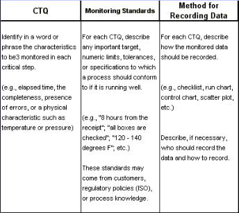
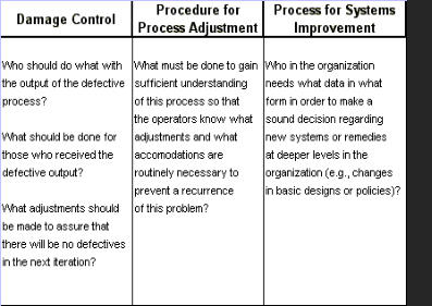
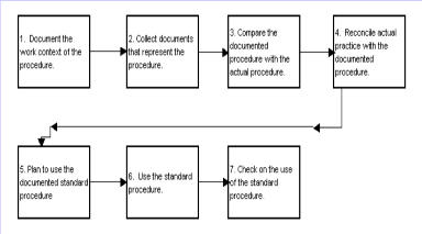
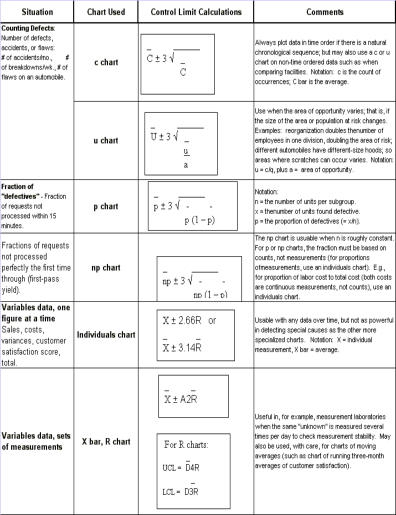
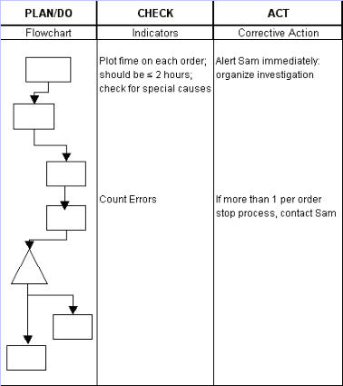
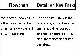
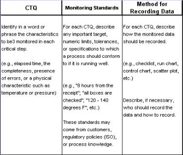
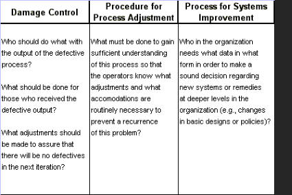
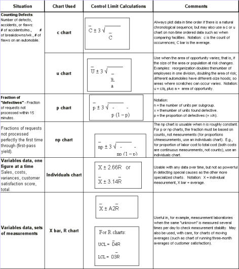
During the IMPROVE phase, the solution was piloted, and you made plans for a full- scale implementation. However, putting a solution in place can fix the problem for the moment, but the real work is in this phase. CONTROL is all about helping you make sure the problem stays corrected and that the new methods can be improved upon further over time. The tools that are most commonly used in the Control phase are: 1. Control charts 2. Data Collection 3. Flow diagrams 4. Charts to compare before and after, such as frequency plots, pareto charts, etc. 5. Quality Control Process Chart 6. Standardization Quality Control To effectively maintain new standard methods, you really need to: · Verify the results and validate that changes adhere to all operating and compliance policies. · Document the new methods in such a way that people will find them easy to use, and provide training to everyone who will use the new methods. · Monitor implementation and make regular course corrections. · Summarize your learning and share them with co-workers involved in similar projects, with customers, and with managers who need to know the final outcome. · Think about what should be taken on next in the process to further improve the sigma level(s). Quality Control Process Chart A QC Process Chart is a tool that helps you document the Deming Cycle of PDCA: Plan- Do-Check-Act for the process. You can use any type of flowchart that you want in the far left "Plan/Do" column (see chart below). Typically a deployment flowchart is used for an administrative or service process, and an activity flowchart is used for a manufacturing process. The key is to make sure you capture the essential steps of the process. In manufacturing situations, the Check column will often describe any technical specifications that must be met or objectives that have to be attained. For administrative and service processes, the Check usually describes quality criteria that have been defined specifically for the process. An important element of Control is to make sure that everyone is using the new process according to the tested methods. These are the methods that you know will produce the desired results, as a product of your efforts to get to the phase. THE PLAN FOR DOING THE WORK CHECKING THE WORK Nothing happens on a reliable, sustained basis unless you build a system to cause it to happen on a consistent, reliable and sustained basis. Remember that Standardization Standardization is what allows high quality to happen on a reliable, sustained basis. It is making sure that important elements of a process are performed consistently in the best possible way. Changes are made only when data show that a new alternative is better. Uses of standard practices · To reduce variation among individuals or groups (and so make process output more predictable). · To provide "know-why" for operators and managers now on the job. · To provide a basis for training new people · To provide a trail for tracing problems · To provide a means to capture and retain knowledge. · To give direction in the case of unusual conditions. Monitoring: Control Charts Ongoing monitoring is typically managed with a control chart. Uses for control charts: · Determine appropriate managerial action in the response to the value of a data point from a particular process. - to see if high or low points are due to special causes. · Understand and predict process capability (expected range of future values) for planning purposes. · Identify root causes (vital few Xs) of variation by differentiating between special and common cause of variation in the data. · See whether intentional changes in a process had the desired result. · Monitor key processes and identify shifts or changes quickly to help hold the gains made from an improvement project. Common-Cause Variation Common causes are the process inputs and conditions that contribute to the regular, everyday variation in a process. Common causes are a part of the process inherently and they contribute to the output variation because they themselves vary. Each common cause contributes a small part of the total variation. By observing a process over time, you should know how much variation to expect from common causes. The process is stable, or predictable, when all the variation is due only to common causes. Special-Cause Variation Special causes are factors that are not always present in a process but that do appear because of some particular circumstance. That is, special causes are not usually or normally present. They may come and go sporadically, and may be temporary or long- term. A special cause is something special or specific that has a definite effect on the process. Worse yet, you are not able to predict when a special cause will occur or how it might affect your process. The process is unstable, or unpredictable whenever special causes contribute to your variation. As mentioned before, there are some tests or criteria to test the presence of Special Causes. They are: · 8 or more points in a row on the same side of the median indicates a process shift. · If the data are symmetrical, it's ok to use the average as the centerline instead of the median. · 6 or more points in a row continuously increasing or decreasing indicates a trend. · Start counting at the point where the direction changes. · Too few runs indicate a shift in the process average, a cycle, or a trend. · Too many runs indicates sampling from two sources, over-compensation on an adjustment, or bias. · 14 or more points in a row alternating up and down indicates bias or sampling problems. · One or more points outside the control limits indicates that something is different about those points. Individual Chart Since they can be used with any data that is time-ordered, and in general are very versatile, individual charts are the most frequently used type of control charts. With some particular kinds of data or situations, however, they are sometimes slower to signal special causes than other kinds of charts available, so it's best to understand other types of control charts as well. Specification Limits vs. Control Limits Specification limits come from engineering or customer requirements, represent what someone wants a process to do, and can sometimes be changed by changing the requirements of the product or service. Control Limits come from calculations on the process data and represent what a process is actually capable of doing; it can only be changed by changing the process. When to calculate new control limits? You should calculate new control limits when: 1. you know there was a change in the process based on either statistical evidence (such as 8 data points above or below the centerline), or you have determined why the change occurred. 2. You are confident the process will stay changed when you know the change was not temporary and the change has become a standard part of the process. Calculate the new limits when you have enough data points to see a significant change. Call the new limits temporary until you get at least 24 new data points. Assumptions for individual charts: · Data are roughly normal · Data points are independent. What to look for when using control charts - a good control chart is one that is being used concurrently with the process. · Charts should be posted or be readily at hand. · Charts should be up-to-date. · Charts should look well-used. · Comments should be written on charts reflecting - dates of process changes, notes on events that might cause problems later, confirmation of verified special causes, and actions taken to eliminate special causes. Common Mistakes When Using Control Charts: 1. Chart not created correctly - the wrong formula was used to calculate "3 sigma" limits; wrong type of charts was used based on type of data collected; and missing or poor, erroneous measurements. 2. Chart not regularly updated - data on charts is not current; process adjustments were not noted; and control limits and average have not been updated. 3. Actions taken are in appropriate/no action taken - rewards given for "good points" or explanations sought for "bad points" even though they are not signaled as special; special-cause signals ignored; non-random patterns or cycles not studied to determine specific causes; and spec limits or goals are placed on chart instead of control limits. Control Charts for Discrete Data (p, np, c, u charts) There are various control chart types depending upon the type of information you wish to collect or chart. Typically, different types of control charts are used for different types of data. They all differentiate special-cause from common-cause variation, and they all use control limits to indicate if an individual data value is due to a special cause. Each type of control chart should have at least 24 data points to calculate control limits with. Recapping for your memory: - Continuous data is obtained by measurring. - Discrete data is obtained by countingg events that meet certain criteria. Charts - p, np - The charts are used when counting items with an attribute. Charts - c, u - The charts are used when counting occurrences: Each unit is inspected for mistakes and most of the units are processed the first week of the month; thus the area of opportunity is not the same each week. Assumptions for charts on discrete data: P (or np) chart assumptions are based on the binomial distribution: · Two attributes only (for instance, defective vs. non-defective). · The expected proportion of items with the attribute is constant for each sample. · Occurrence of the attribute is independent from item to item. C (or u) chart assumptions are based on the Poisson distribution: · Can count occurrences, but not non-occurrences. · Probability of an occurrence is relatively rare (less than 10% of the time). · Occurrences are independent (one does not influence the occurrence of another). X-Bar & R Charts These charts are used for high-volume processes with subgroups (see either the Measure chapter or the X-bar & R charts within this web site). When to use an X-bar, R Chart: · Subgroups allow for a precise estimate of "local" variability. · Changes in process variability can be distinguished from changes in process average. · Small shifts in process average can be detected. The advantages of an X, R chart disappears if systemic special causes occur - that is, a special cause that appears in each sub-group. For instance, let's say that you are counting errors in ticket orders taken by phone and you have four operators taking the orders. It would be natural to want to construct subgroups of 4, taking one order form from each operator. However, if one operator is consistently worse, or better, than the others, you would be mixing special-cause and common-cause variations within the data. The chart would be useless as it would obscure the differences between operators and make it very difficult to detect changes in the process or variability. For this reason, you need to consider carefully before you form subgroups of data from: · Values from different operators, machines, shifts, or fixtures. · Data determined by calendar weeks, months, or quarters. Best subgroup selection criteria - in order to minimize the chance of special causes within subgroups you should: · Keep subgroup size small (typically 5 or fewer data points). · Use "adjacent" items in subgroups; something sequentially in time order. Assumptions for X-bar, R charts Underlying assumption - -- common-cause variation within sub-groups is equal to the common-cause variation between sub-groups. If this assumption does not hold, the X limits will either be too wide or too narrow. EWMA Charts Exponentially Weight Moving Average - these charts are used for detecting small shifts quickly. The moving average "smoothes" the variation. EWMA Charts are appropriate if: · Data are continuous (either subgroups or individuals). · You need to detect small shifts in the process average quickly. · You want to be able to predict the next value in an unstable environment. · Data need to be time ordered. EWMA Charts are not appropriate if you want to identify a large sporadic special cluster (one point outside the limit). How the EWMA Chart works: · Instead of weighting each point equally in the moving average, the weights decrease (exponentially) going backwards in time. · The largest weight is given to the most recent point; it's like saying the chart has a memory that fades over time. · While the calculations may seem complicated, computer software provides a simple way to do EWMA Charts. Summary of Control Charts Procedure for using control charts: · Decide what type of control chart to use based upon the type of data you are plotting; how is it collected, individually or in subgroups? · Construct the control chart. · Interpret the control chart after data is plotted - look for signals of special causes and determine appropriate actions. · Maintain the control chart - update the plotted points as they occur; determine appropriate actions immediately; and recalculate the control limits when appropriate. KEY LEARNINGS The importance of closure: · Recognize the considerable time and effort that went into the initiative. · Capture the learnings from the initiative - about the problem or process being studied, and about improvement process itself. · Share the learnings with others, and like processes. · Hand over responsibilities for standardization and monitoring to the appropriate people. Closure Checklist: · Avoid needless continuation · Summarize learnings about the work process and the team's process · Finalize documentation on improvements · Summarize future plans and recommendations · Communicate the ending. · Celebrate the success attained. Completion Checklist By the end of this phase you should be able to demonstrate and explain: · What the data showed about the effectiveness of the solution, and how the actual results compare to the plan. · Why you are now confident that the current solution should be standardized. · How the new methods have been documented and how this is used in the day- to-day business plan. · What you do to monitor the process and sustain the gains. · What the key learnings are and what recommendations the team developed for further improvements. IF YOU HAVE MADE IT THIS FAR, CONGRATULATIONS, YOU HAVE FINISHED LEARNING ABOUT THE BASICS OF SIX SIGMA METHODOLOGIES.


STEP #5 - CONTROL
STANDARDIZE & MONITOR


© The Quality Web, authored by Frank E. Armstrong, Making Sense
Chronicles - 2003 - 2016
PHASE 5 - CONTROL
During the IMPROVE phase, the solution was piloted, and you made plans for a full-scale implementation. However, putting a solution in place can fix the problem for the moment, but the real work is in this phase. CONTROL is all about helping you make sure the problem stays corrected and that the new methods can be improved upon further over time. The tools that are most commonly used in the Control phase are: 1. Control charts 2. Data Collection 3. Flow diagrams 4. Charts to compare before and after, such as frequency plots, pareto charts, etc. 5. Quality Control Process Chart 6. Standardization Quality Control To effectively maintain new standard methods, you really need to: · Verify the results and validate that changes adhere to all operating and compliance policies. · Document the new methods in such a way that people will find them easy to use, and provide training to everyone who will use the new methods. · Monitor implementation and make regular course corrections. · Summarize your learning and share them with co-workers involved in similar projects, with customers, and with managers who need to know the final outcome. · Think about what should be taken on next in the process to further improve the sigma level(s). Quality Control Process Chart A QC Process Chart is a tool that helps you document the Deming Cycle of PDCA: Plan-Do-Check-Act for the process. You can use any type of flowchart that you want in the far left "Plan/Do" column (see chart below). Typically a deployment flowchart is used for an administrative or service process, and an activity flowchart is used for a manufacturing process. The key is to make sure you capture the essential steps of the process. In manufacturing situations, the Check column will often describe any technical specifications that must be met or objectives that have to be attained. For administrative and service processes, the Check usually describes quality criteria that have been defined specifically for the process. An important element of Control is to make sure that everyone is using the new process according to the tested methods. These are the methods that you know will produce the desired results, as a product of your efforts to get to the phase. THE PLAN FOR DOING THE WORK CHECKING THE WORK Nothing happens on a reliable, sustained basis unless you build a system to cause it to happen on a consistent, reliable and sustained basis. Remember that Standardization Standardization is what allows high quality to happen on a reliable, sustained basis. It is making sure that important elements of a process are performed consistently in the best possible way. Changes are made only when data show that a new alternative is better. Uses of standard practices · To reduce variation among individuals or groups (and so make process output more predictable). · To provide "know-why" for operators and managers now on the job. · To provide a basis for training new people · To provide a trail for tracing problems · To provide a means to capture and retain knowledge. · To give direction in the case of unusual conditions. Monitoring: Control Charts Ongoing monitoring is typically managed with a control chart. Uses for control charts: · Determine appropriate managerial action in the response to the value of a data point from a particular process. - to see if high or low points are due to special causes. · Understand and predict process capability (expected range of future values) for planning purposes. · Identify root causes (vital few Xs) of variation by differentiating between special and common cause of variation in the data. · See whether intentional changes in a process had the desired result. · Monitor key processes and identify shifts or changes quickly to help hold the gains made from an improvement project. Common-Cause Variation Common causes are the process inputs and conditions that contribute to the regular, everyday variation in a process. Common causes are a part of the process inherently and they contribute to the output variation because they themselves vary. Each common cause contributes a small part of the total variation. By observing a process over time, you should know how much variation to expect from common causes. The process is stable, or predictable, when all the variation is due only to common causes. Special-Cause Variation Special causes are factors that are not always present in a process but that do appear because of some particular circumstance. That is, special causes are not usually or normally present. They may come and go sporadically, and may be temporary or long-term. A special cause is something special or specific that has a definite effect on the process. Worse yet, you are not able to predict when a special cause will occur or how it might affect your process. The process is unstable, or unpredictable whenever special causes contribute to your variation. As mentioned before, there are some tests or criteria to test the presence of Special Causes. They are: · 8 or more points in a row on the same side of the median indicates a process shift. · If the data are symmetrical, it's ok to use the average as the centerline instead of the median. · 6 or more points in a row continuously increasing or decreasing indicates a trend. · Start counting at the point where the direction changes. · Too few runs indicate a shift in the process average, a cycle, or a trend. · Too many runs indicates sampling from two sources, over- compensation on an adjustment, or bias. · 14 or more points in a row alternating up and down indicates bias or sampling problems. · One or more points outside the control limits indicates that something is different about those points. Individual Chart Since they can be used with any data that is time-ordered, and in general are very versatile, individual charts are the most frequently used type of control charts. With some particular kinds of data or situations, however, they are sometimes slower to signal special causes than other kinds of charts available, so it's best to understand other types of control charts as well. Specification Limits vs. Control Limits Specification limits come from engineering or customer requirements, represent what someone wants a process to do, and can sometimes be changed by changing the requirements of the product or service. Control Limits come from calculations on the process data and represent what a process is actually capable of doing; it can only be changed by changing the process. When to calculate new control limits? You should calculate new control limits when: 1. you know there was a change in the process based on either statistical evidence (such as 8 data points above or below the centerline), or you have determined why the change occurred. 2. You are confident the process will stay changed when you know the change was not temporary and the change has become a standard part of the process. Calculate the new limits when you have enough data points to see a significant change. Call the new limits temporary until you get at least 24 new data points. Assumptions for individual charts: · Data are roughly normal · Data points are independent. What to look for when using control charts - a good control chart is one that is being used concurrently with the process. · Charts should be posted or be readily at hand. · Charts should be up-to-date. · Charts should look well-used. · Comments should be written on charts reflecting - dates of process changes, notes on events that might cause problems later, confirmation of verified special causes, and actions taken to eliminate special causes. Common Mistakes When Using Control Charts: 1. Chart not created correctly - the wrong formula was used to calculate "3 sigma" limits; wrong type of charts was used based on type of data collected; and missing or poor, erroneous measurements. 2. Chart not regularly updated - data on charts is not current; process adjustments were not noted; and control limits and average have not been updated. 3. Actions taken are in appropriate/no action taken - rewards given for "good points" or explanations sought for "bad points" even though they are not signaled as special; special-cause signals ignored; non-random patterns or cycles not studied to determine specific causes; and spec limits or goals are placed on chart instead of control limits. Control Charts for Discrete Data (p, np, c, u charts) There are various control chart types depending upon the type of information you wish to collect or chart. Typically, different types of control charts are used for different types of data. They all differentiate special-cause from common-cause variation, and they all use control limits to indicate if an individual data value is due to a special cause. Each type of control chart should have at least 24 data points to calculate control limits with. Recapping for your memory: - Continuous data is obtained by measurring. - Discrete data is obtained by countingg events that meet certain criteria. Charts - p, np - The charts are used when counting items with an attribute. Charts - c, u - The charts are used when counting occurrences: Each unit is inspected for mistakes and most of the units are processed the first week of the month; thus the area of opportunity is not the same each week. Assumptions for charts on discrete data: P (or np) chart assumptions are based on the binomial distribution: · Two attributes only (for instance, defective vs. non- defective). · The expected proportion of items with the attribute is constant for each sample. · Occurrence of the attribute is independent from item to item. C (or u) chart assumptions are based on the Poisson distribution: · Can count occurrences, but not non-occurrences. · Probability of an occurrence is relatively rare (less than 10% of the time). · Occurrences are independent (one does not influence the occurrence of another). X-Bar & R Charts These charts are used for high-volume processes with subgroups (see either the Measure chapter or the X-bar & R charts within this web site). When to use an X-bar, R Chart: · Subgroups allow for a precise estimate of "local" variability. · Changes in process variability can be distinguished from changes in process average. · Small shifts in process average can be detected. The advantages of an X, R chart disappears if systemic special causes occur - that is, a special cause that appears in each sub- group. For instance, let's say that you are counting errors in ticket orders taken by phone and you have four operators taking the orders. It would be natural to want to construct subgroups of 4, taking one order form from each operator. However, if one operator is consistently worse, or better, than the others, you would be mixing special-cause and common-cause variations within the data. The chart would be useless as it would obscure the differences between operators and make it very difficult to detect changes in the process or variability. For this reason, you need to consider carefully before you form subgroups of data from: · Values from different operators, machines, shifts, or fixtures. · Data determined by calendar weeks, months, or quarters. Best subgroup selection criteria - in order to minimize the chance of special causes within subgroups you should: · Keep subgroup size small (typically 5 or fewer data points). · Use "adjacent" items in subgroups; something sequentially in time order. Assumptions for X-bar, R charts Underlying assumption - -- common-cause variation within sub- groups is equal to the common-cause variation between sub- groups. If this assumption does not hold, the X limits will either be too wide or too narrow. EWMA Charts Exponentially Weight Moving Average - these charts are used for detecting small shifts quickly. The moving average "smoothes" the variation. EWMA Charts are appropriate if: · Data are continuous (either subgroups or individuals). · You need to detect small shifts in the process average quickly. · You want to be able to predict the next value in an unstable environment. · Data need to be time ordered. EWMA Charts are not appropriate if you want to identify a large sporadic special cluster (one point outside the limit). How the EWMA Chart works: · Instead of weighting each point equally in the moving average, the weights decrease (exponentially) going backwards in time. · The largest weight is given to the most recent point; it's like saying the chart has a memory that fades over time. · While the calculations may seem complicated, computer software provides a simple way to do EWMA Charts. Summary of Control Charts Procedure for using control charts: · Decide what type of control chart to use based upon the type of data you are plotting; how is it collected, individually or in subgroups? · Construct the control chart. · Interpret the control chart after data is plotted - look for signals of special causes and determine appropriate actions. · Maintain the control chart - update the plotted points as they occur; determine appropriate actions immediately; and recalculate the control limits when appropriate. KEY LEARNINGS The importance of closure: · Recognize the considerable time and effort that went into the initiative. · Capture the learnings from the initiative - about the problem or process being studied, and about improvement process itself. · Share the learnings with others, and like processes. · Hand over responsibilities for standardization and monitoring to the appropriate people. Closure Checklist: · Avoid needless continuation · Summarize learnings about the work process and the team's process · Finalize documentation on improvements · Summarize future plans and recommendations · Communicate the ending. · Celebrate the success attained. Completion Checklist By the end of this phase you should be able to demonstrate and explain: · What the data showed about the effectiveness of the solution, and how the actual results compare to the plan. · Why you are now confident that the current solution should be standardized. · How the new methods have been documented and how this is used in the day- to-day business plan. · What you do to monitor the process and sustain the gains. · What the key learnings are and what recommendations the team developed for further improvements. IF YOU HAVE MADE IT THIS FAR, CONGRATULATIONS, YOU HAVE FINISHED LEARNING ABOUT THE BASICS OF SIX SIGMA METHODOLOGIES.